Mining
Knowledge mining process for this research was comprised of the followings:
-
Analysis of the environmental conditions predictability of participants physiological response through a non-inferential prediction modelling.
-
Investigation of the relationship between environmental conditions and participants physiological response through a non-inferential prediction modelling.
-
Analysis of environmental condition features significance in relation to their role in predicting participants physiological response.
-
Investigation of the patterns of environmental condition features and their influence of participants physiological response.
-
Analysis of the correlations between the feature and geo-referencing participants physiological response (arousal) to a geographical Map of the City.
Predictability
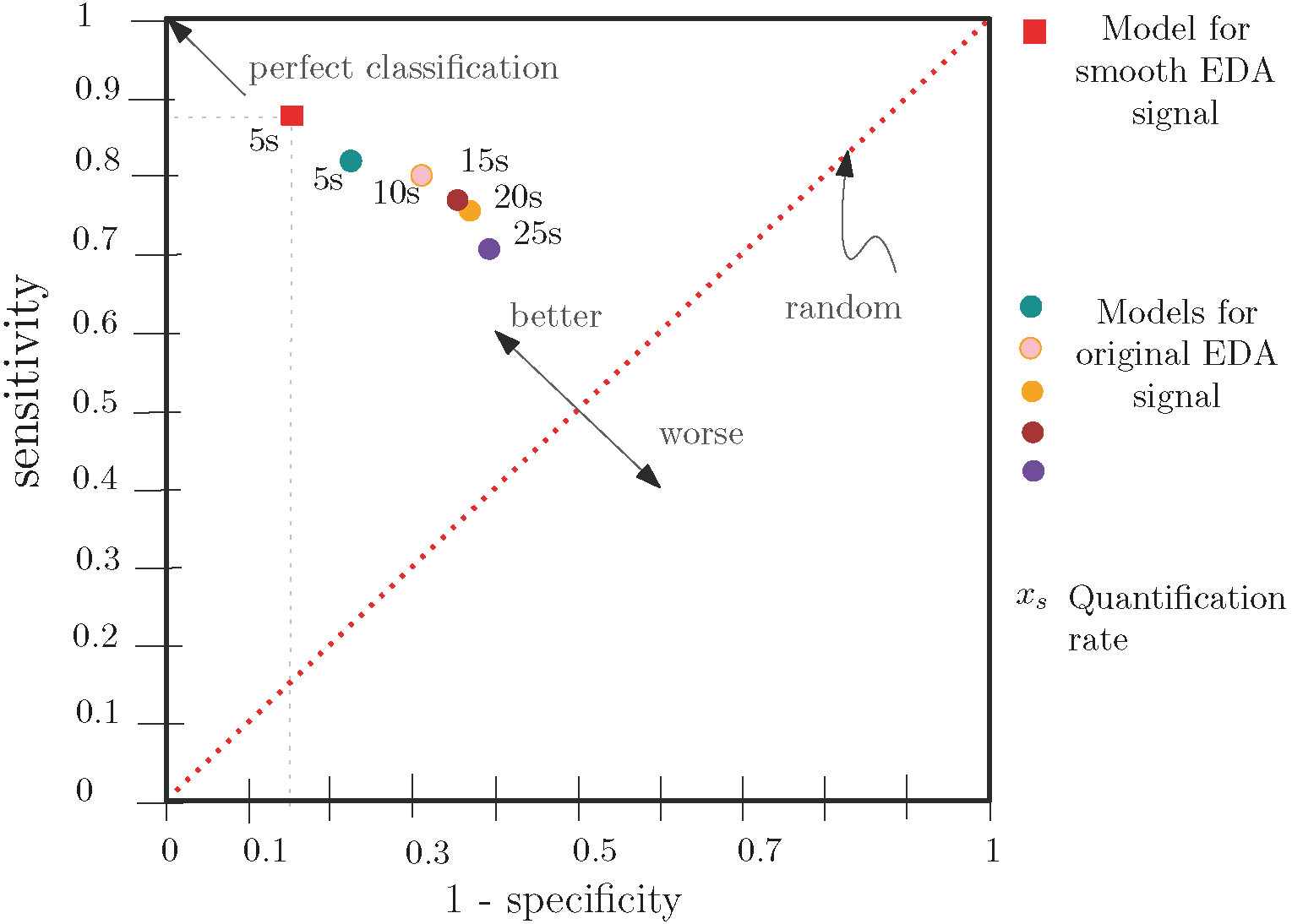
Predictability modeling using Reduced Error Pruning Tree was performed to assess the sensitivity of participant's physiological response towards environmental conditions. To achieve this purpose, five different data quantification rates were set: 5sec, 10sec., 15sec., 20sec., and 25sec.
The hypothesis was if classification model gave us a high accuracy for a smaller quantification rate than a higher quantification rate then it establishes that a participant's physiological response is sensitive towards environmental conditions. This is because it reflects that participant's physiological response changes with small little in change in environmental conditions.
Tool used for modelling:
Weka
Classification results illustration through ROC curve:
Inference
Inferential modeling using Fuzzy Unordered Rule Induction Algorithm was performed to analyze for what specific environmental conditions participants physiological response higher than a threshold, i.e., for what environmental condition participant experienced arousal state.
Tool used for modeling: Keel
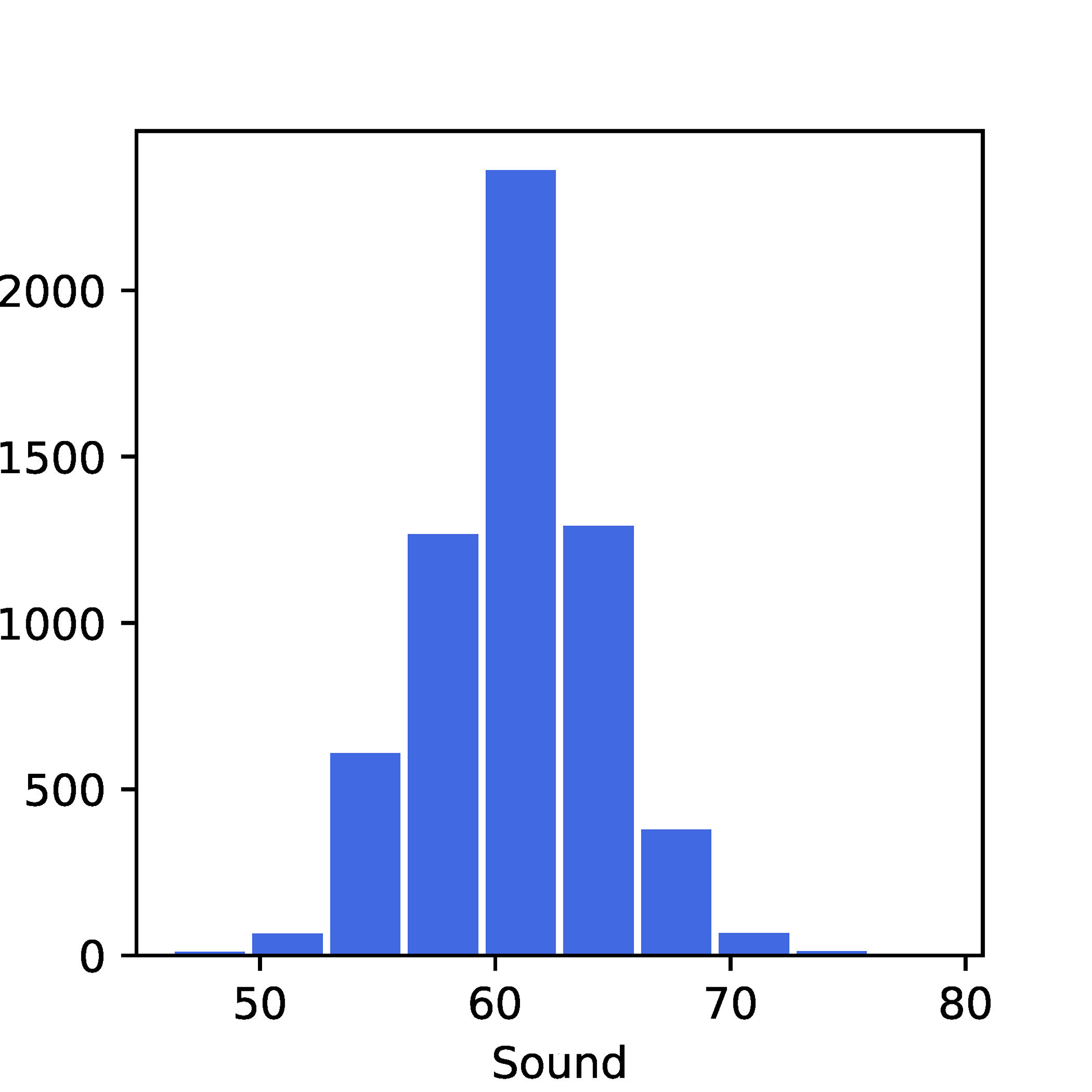
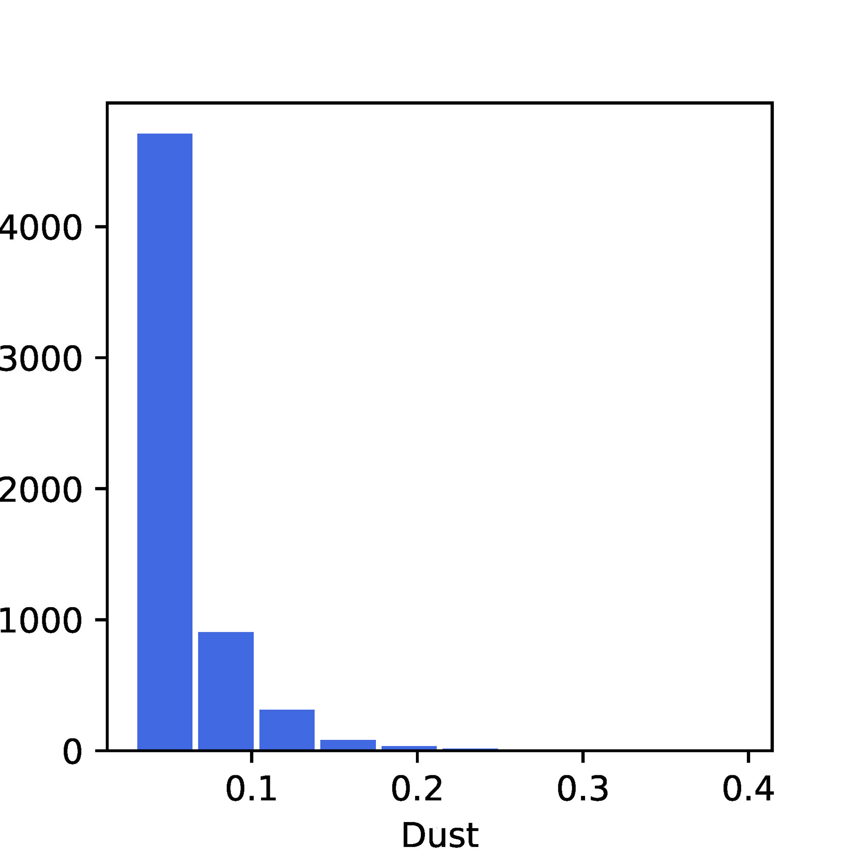
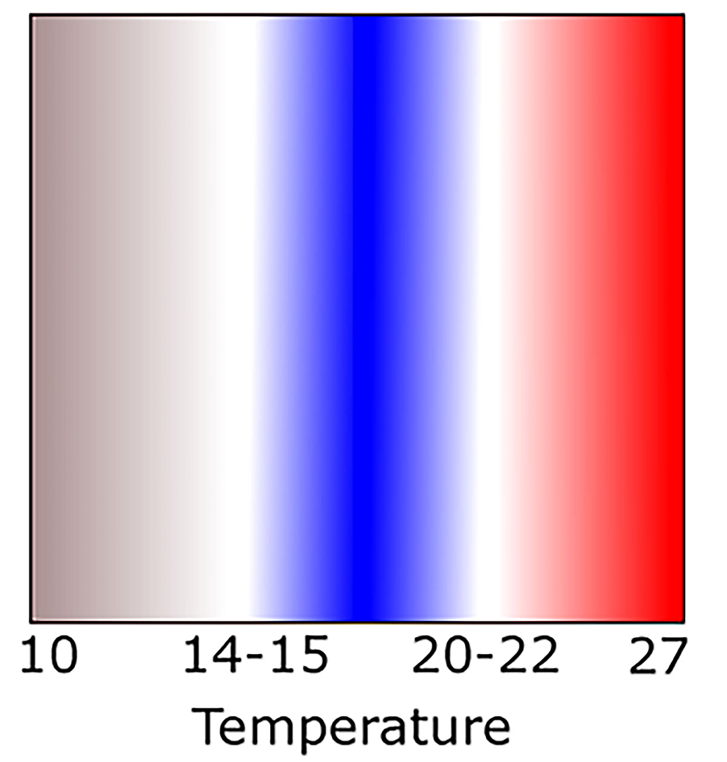
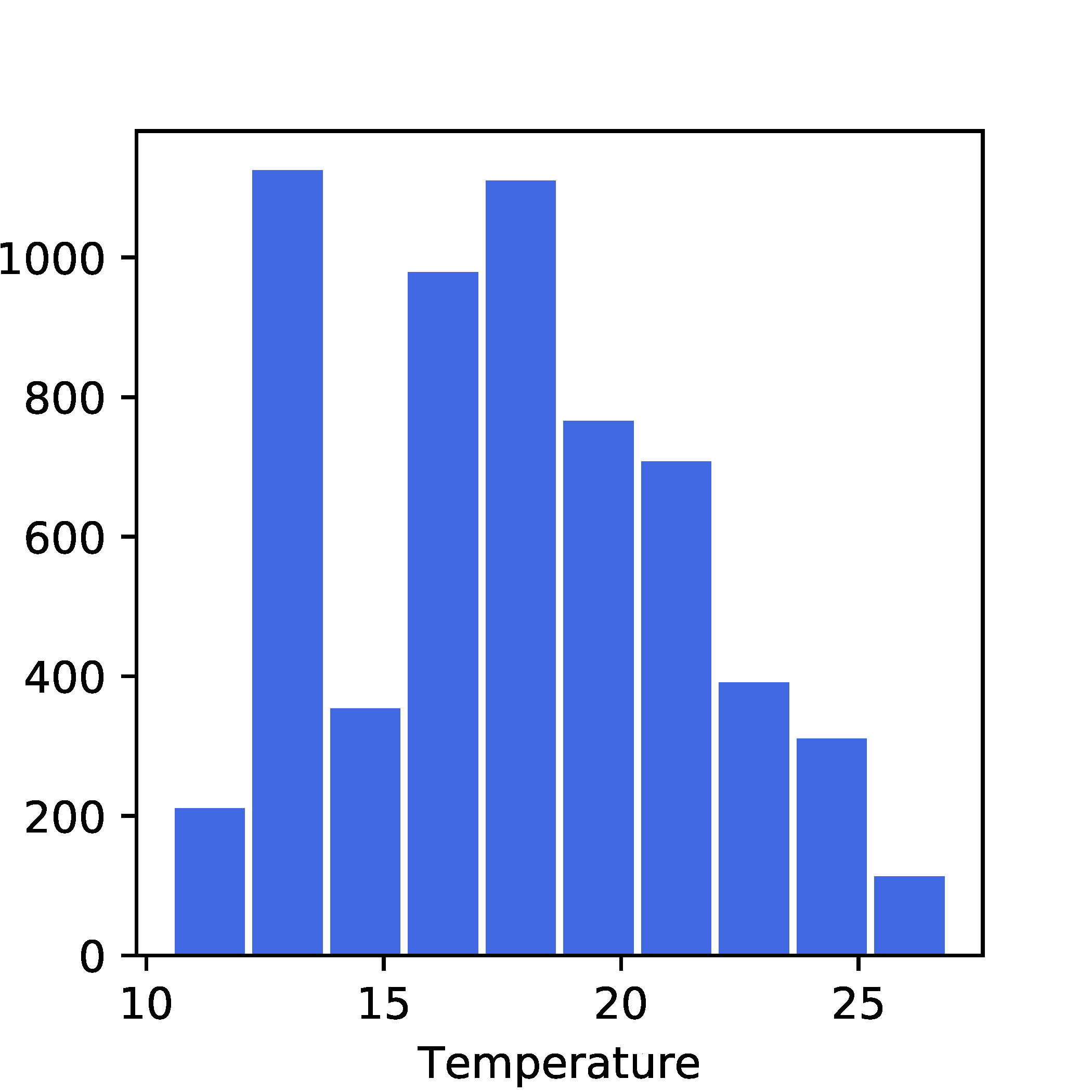
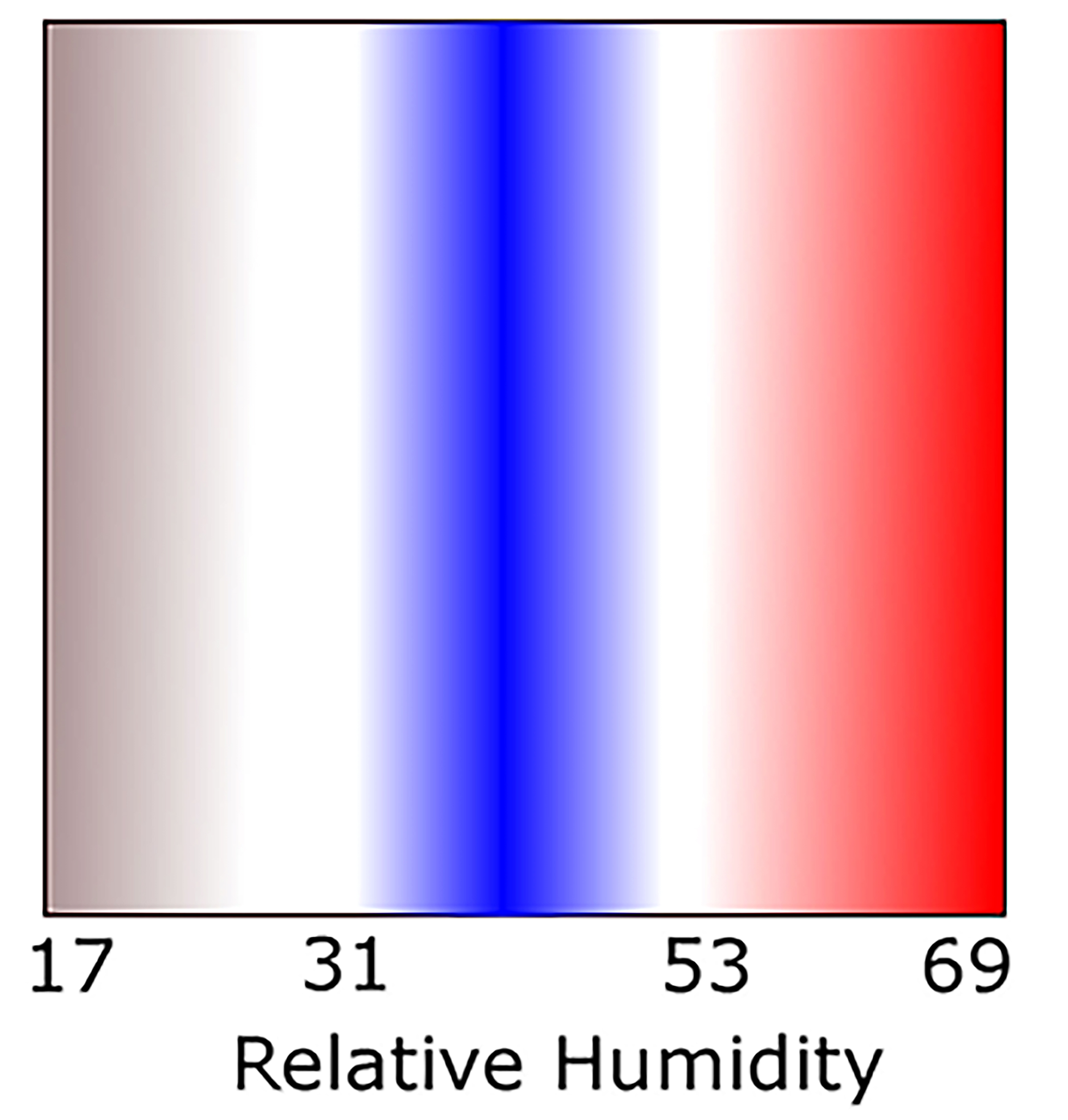
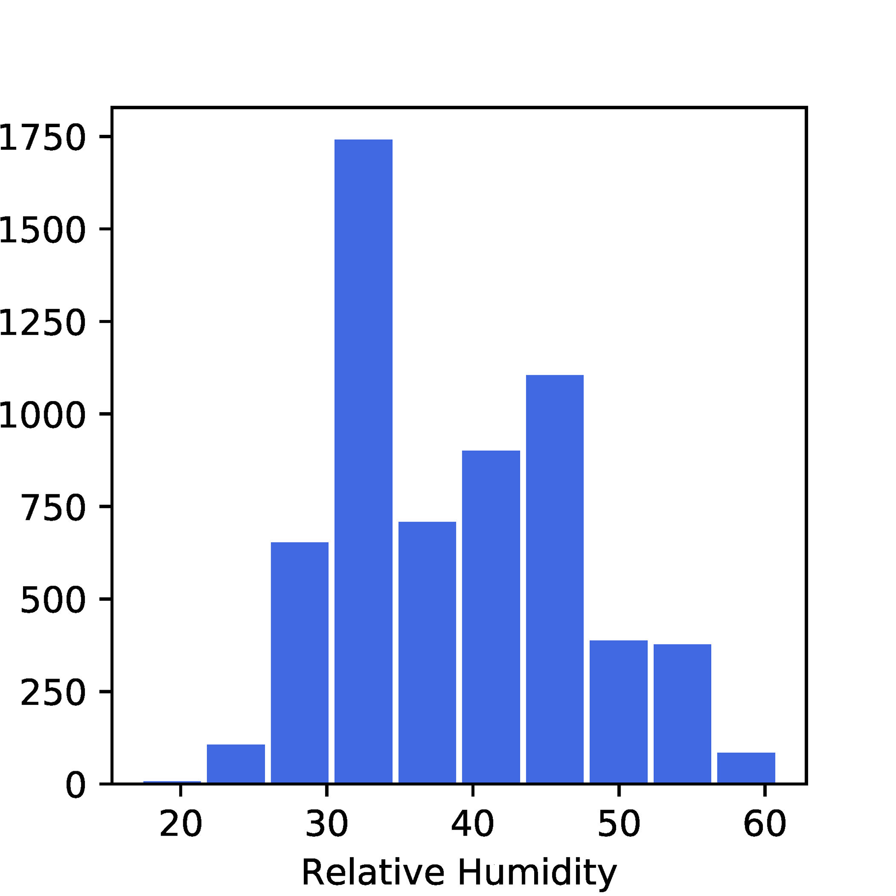
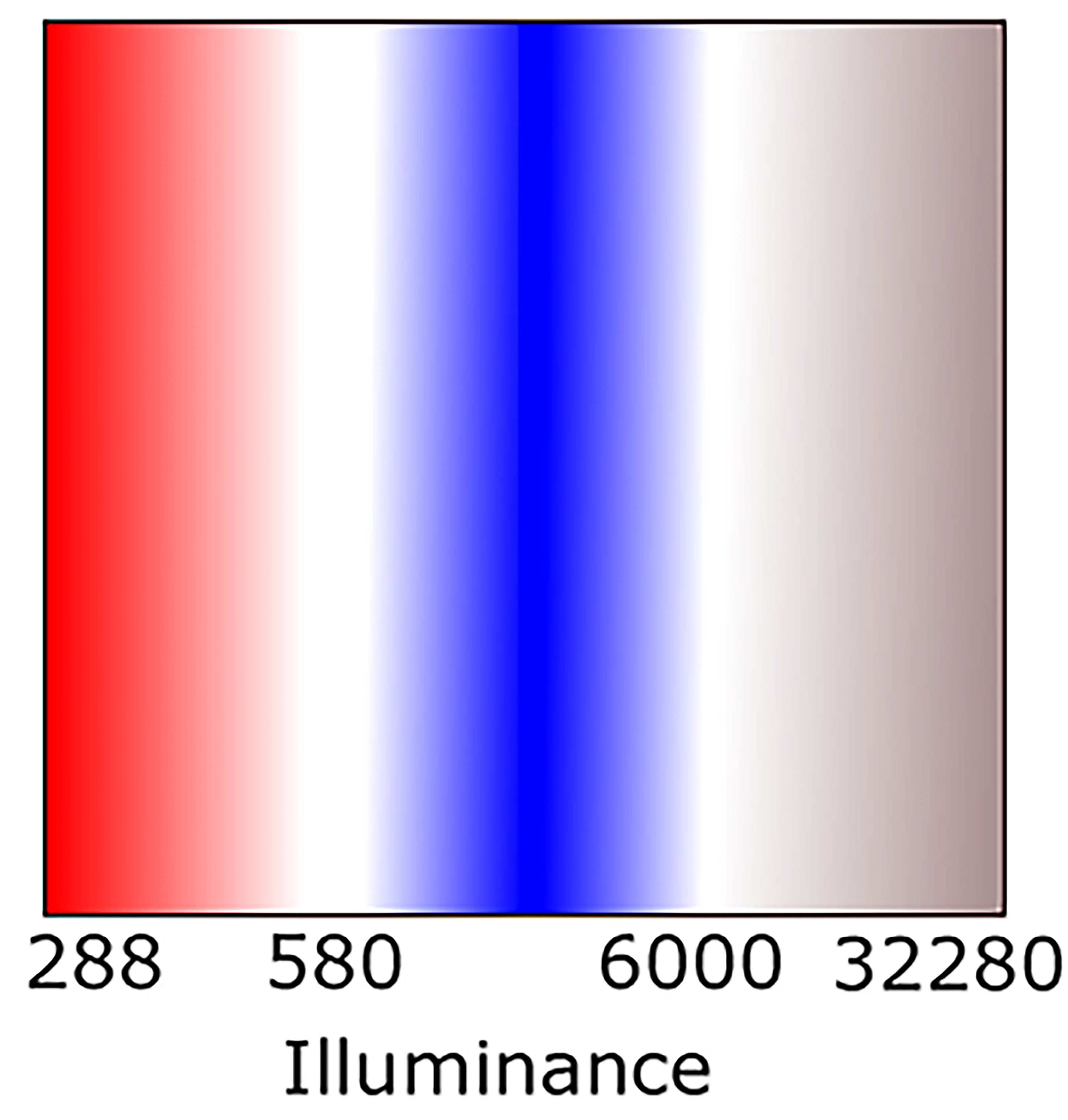
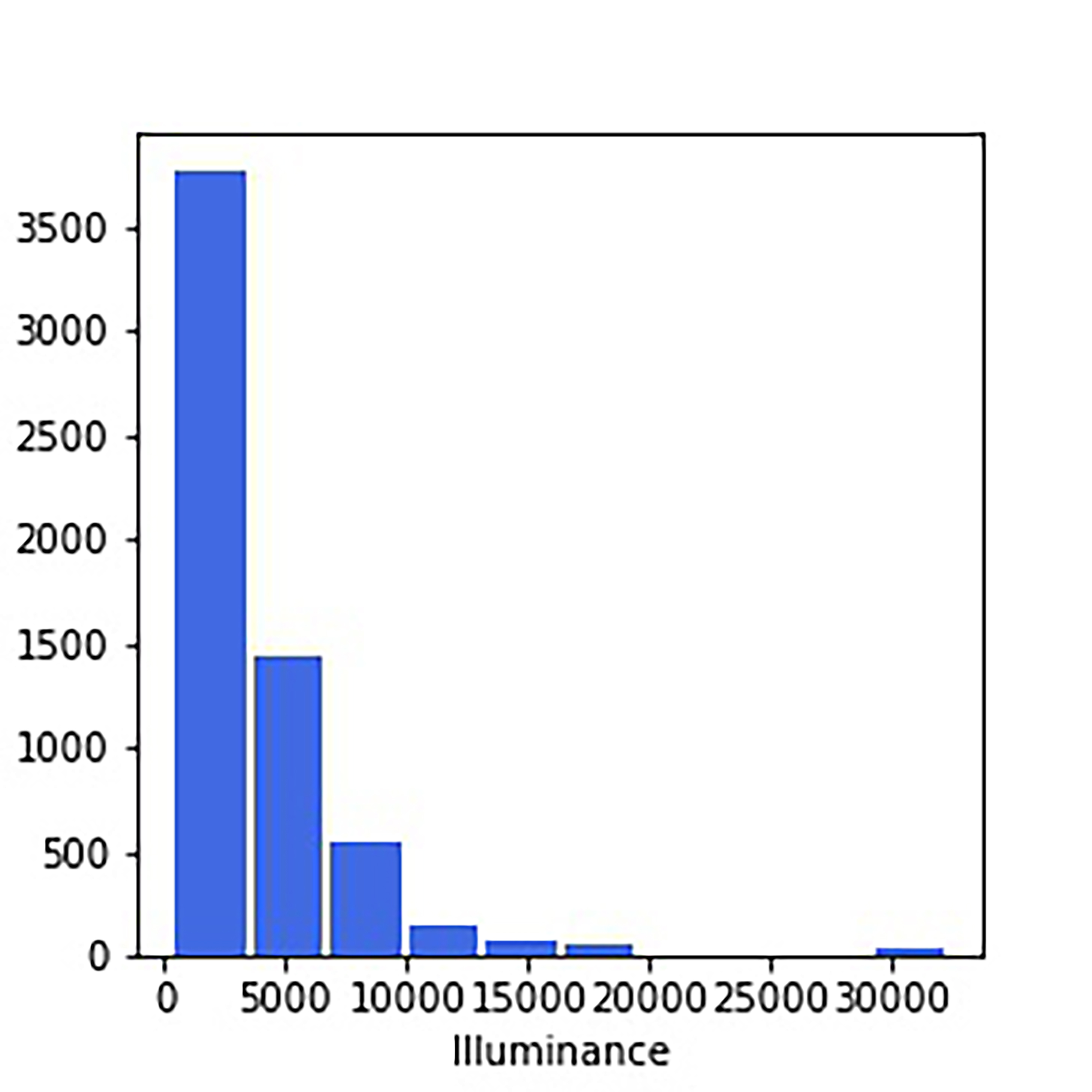
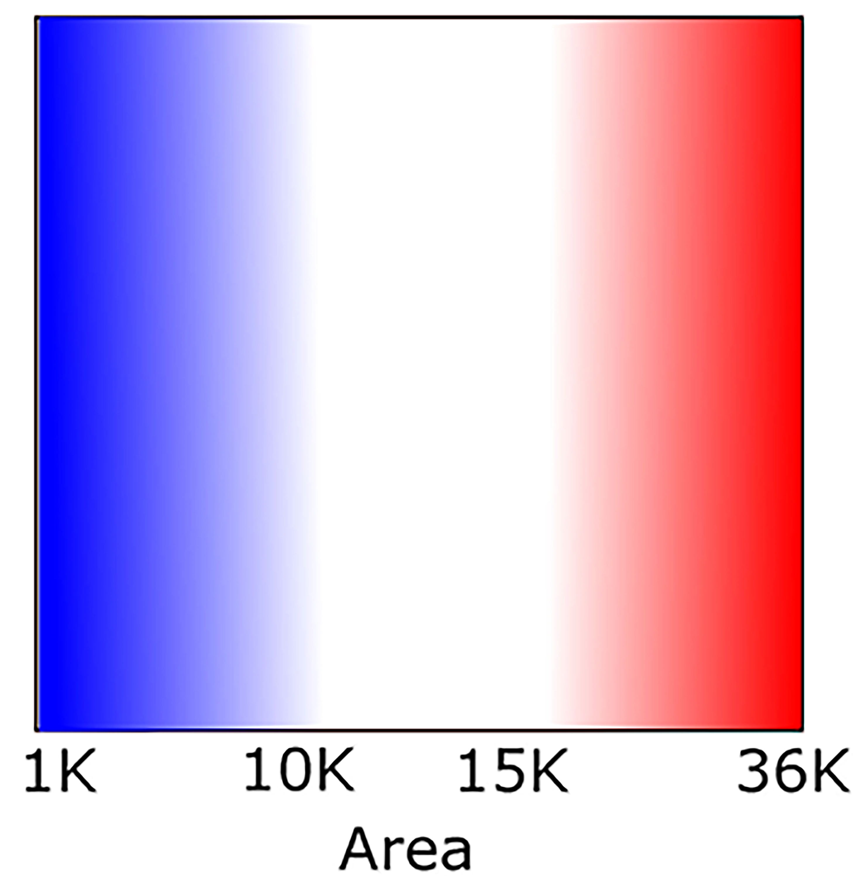
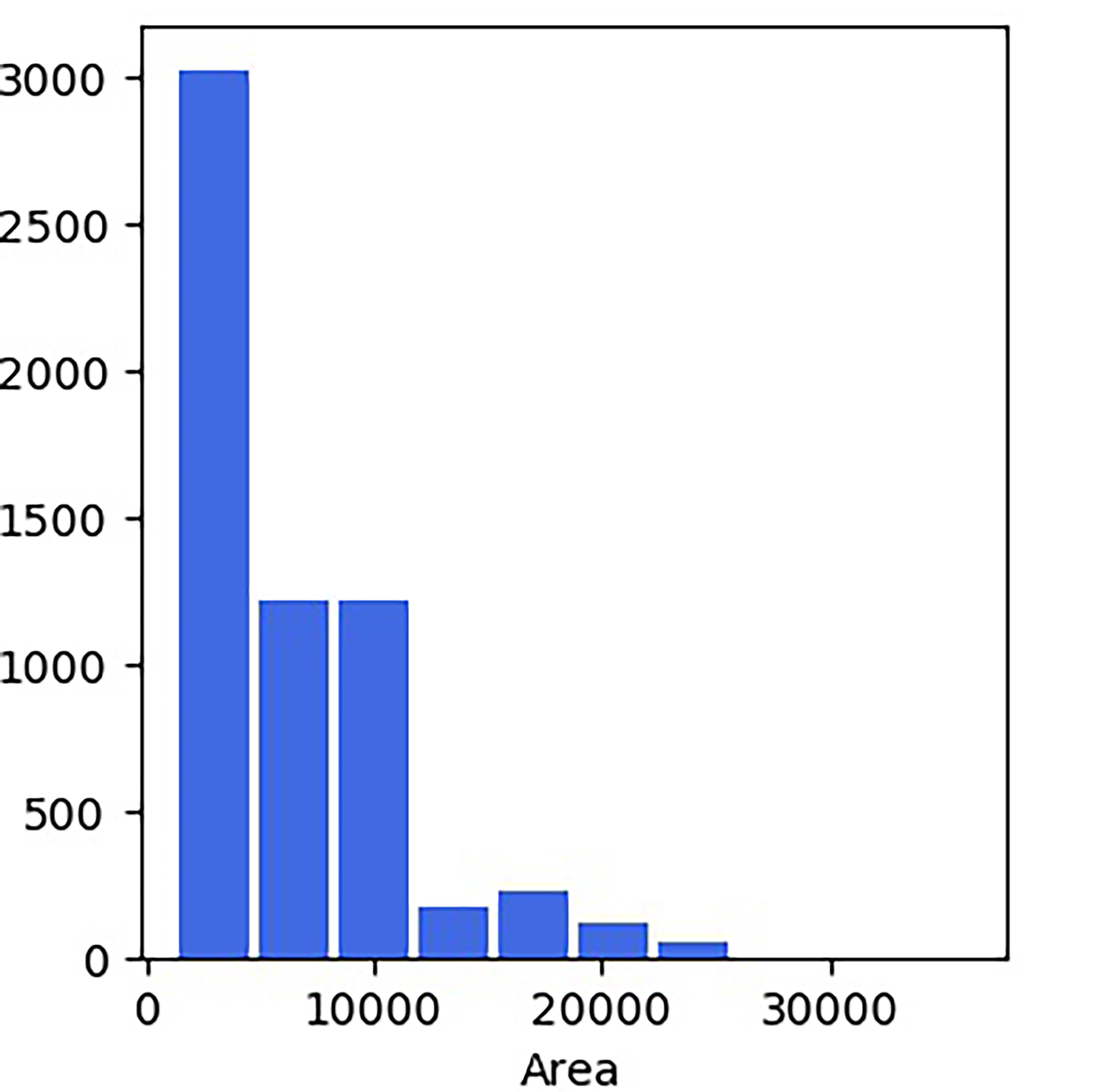
Fuzzy rule interpretation and comparison with features histogram:
Color code:
Red: Arousal state, i.e., significant stimulus due to environmental feature.
Blue: No arousal state, i.e., no significant stimulus due to environmental feature.
Gray: Fuzzy rule does not offer any classification between arousal and no arousal state.
White: A range of fuzziness in assigning an environmental feature value to arousal and no arousal state.
| Fuzzy-rule Interpretation | Histogram | Fuzzy-rule Interpretation | Histogram |
|---|---|---|---|
 |
 |
 |
 |
 |
 |
 |
 |
 |
 |
 |
 |
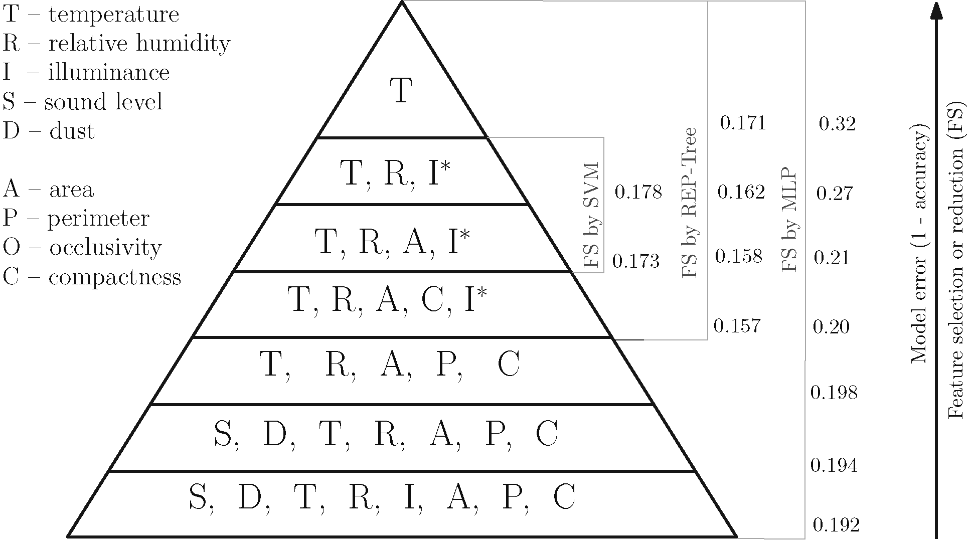
Features
Among all the environmental feature some features may have the higher impact of participants' physiological response than the others. Thus, it was imperative to investigate that which combination of the environmental features has the highest the impact on participants' physiological response.
For this purpose, the following backward linear feature selection framework with three predictors multilayer perceptron (MLP), reduced error pruning tree (REP-Tree), and support vector machine (SVM) was used.
Tool used for the framework: Weka
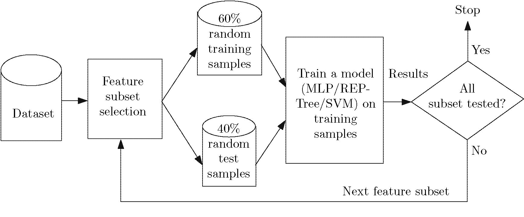
A collection of the feature selection results from the mentioned framework and arranging the feature subsets according to their accuracy in predicting participants' physiological response the following hierarchy was obtained. The obtained hierarchy indicates temperature, humidity, Isovist area, and illuminance were the most important environmental feature subset since all three predictors offered these sets and their accuracies were better than the subsets {temperature, humidity, and illuminance} and {temperature}.
Patterns
The self-organizing map (SOM) shown in the following Fig is a 2-dimensional map of nodes that acquires properties of the m-dimensional input vectors. Thus, SOM form cluster similar alike data. SOM was applied to investigate whether a set participants who experience similar alike environmental conditions also responded similar physiological responses.
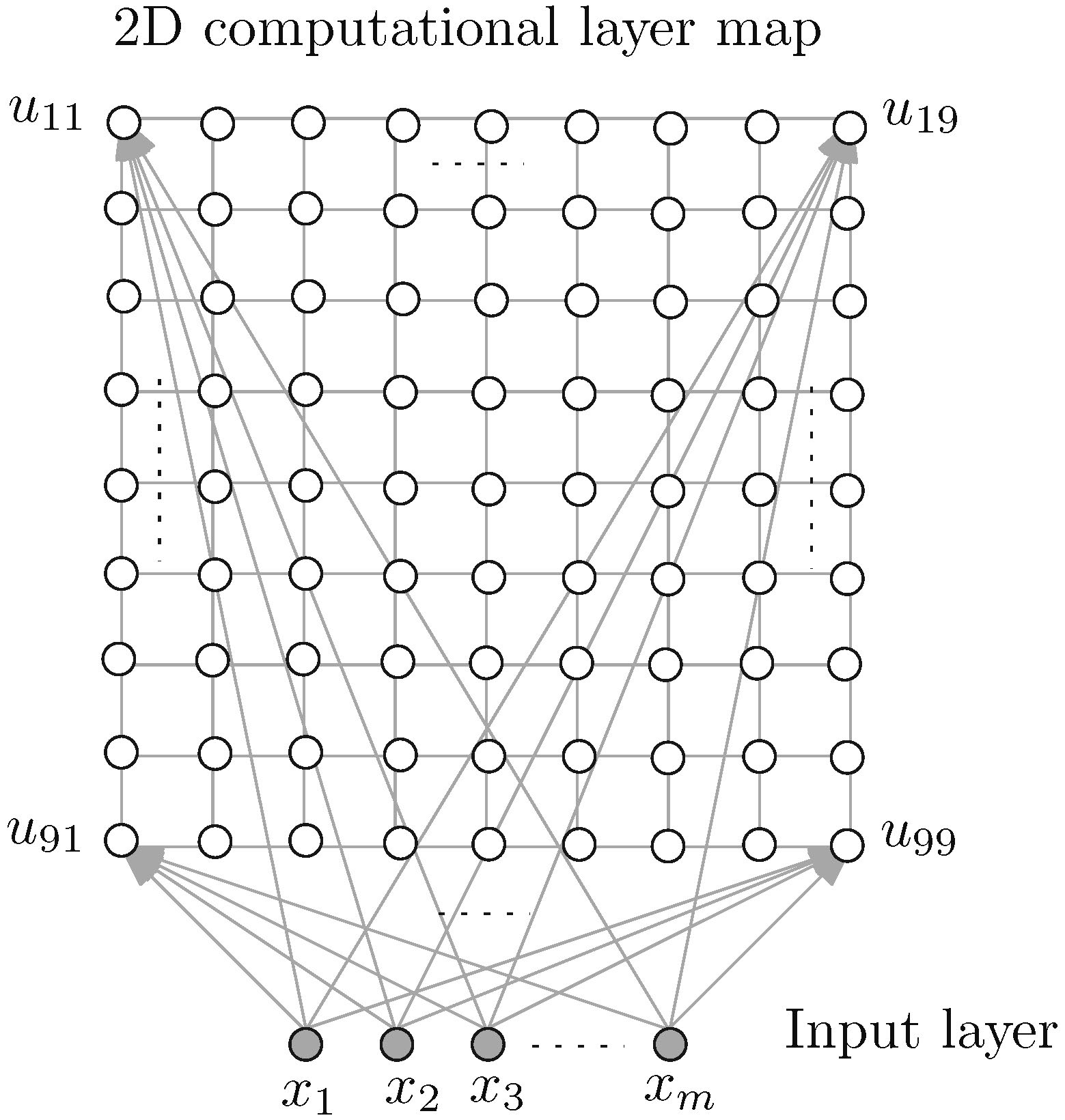
Tool used for SOM construction: SOM toolbox Laboratory of Computer and Information Science (CIS), Helsinki University of Technology.
Each feature was linearly scaled with a variance of one so that they have equal importance in computing distance and influence in forming clusters on the map. A trained SOM offered a unified distance matrix (U-Matrix) that shows cluster on the map which is separated by high values (light color) and the cluster themselves are shown in low values (dark color). The U-matrix can also be interpreted as the nodes possessing similar color forms a cluster. E.g., bright yellow patch on U-Matrix is a cluster that separates distinctly other clusters shown in dark blue. The corresponding label matrix (L-Matrix) shows who were the participant belonging to the clusters on U-Matrix map and what were their physiological response state (blue color on L-Matrix indicate a physiologically aroused state of a participant).
| U-Matrix | L-Matrix |
|---|---|
 |
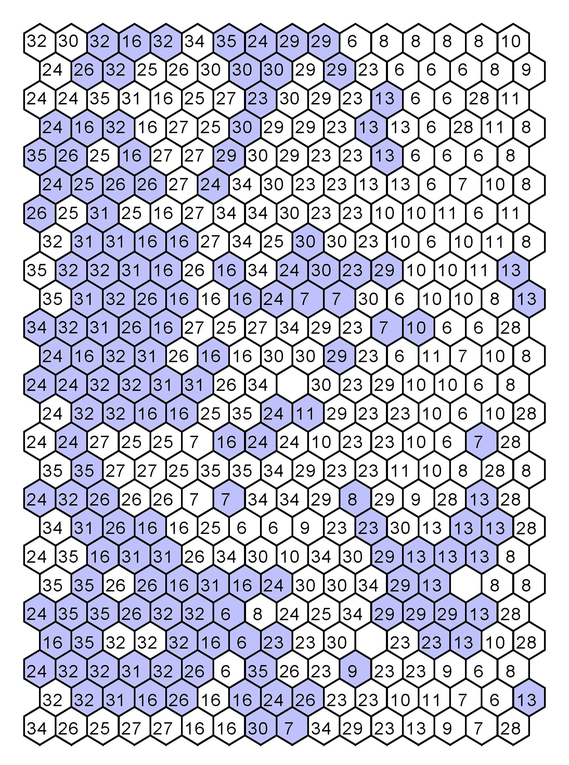 |
Features values are assigned according to U-Matrix. Each node in feature matrix (F-Matrix) are corresponding to the nodes in U-Matrix or L-Matrix for that matter. The nodes in F-Matrix indicate the values of the feature. Hence, comparing F-Matrix with U-Matrix and L-Matrix, one can find patterns as to how environmental feature influence participant physiological response.
| F-Matrix |
|---|
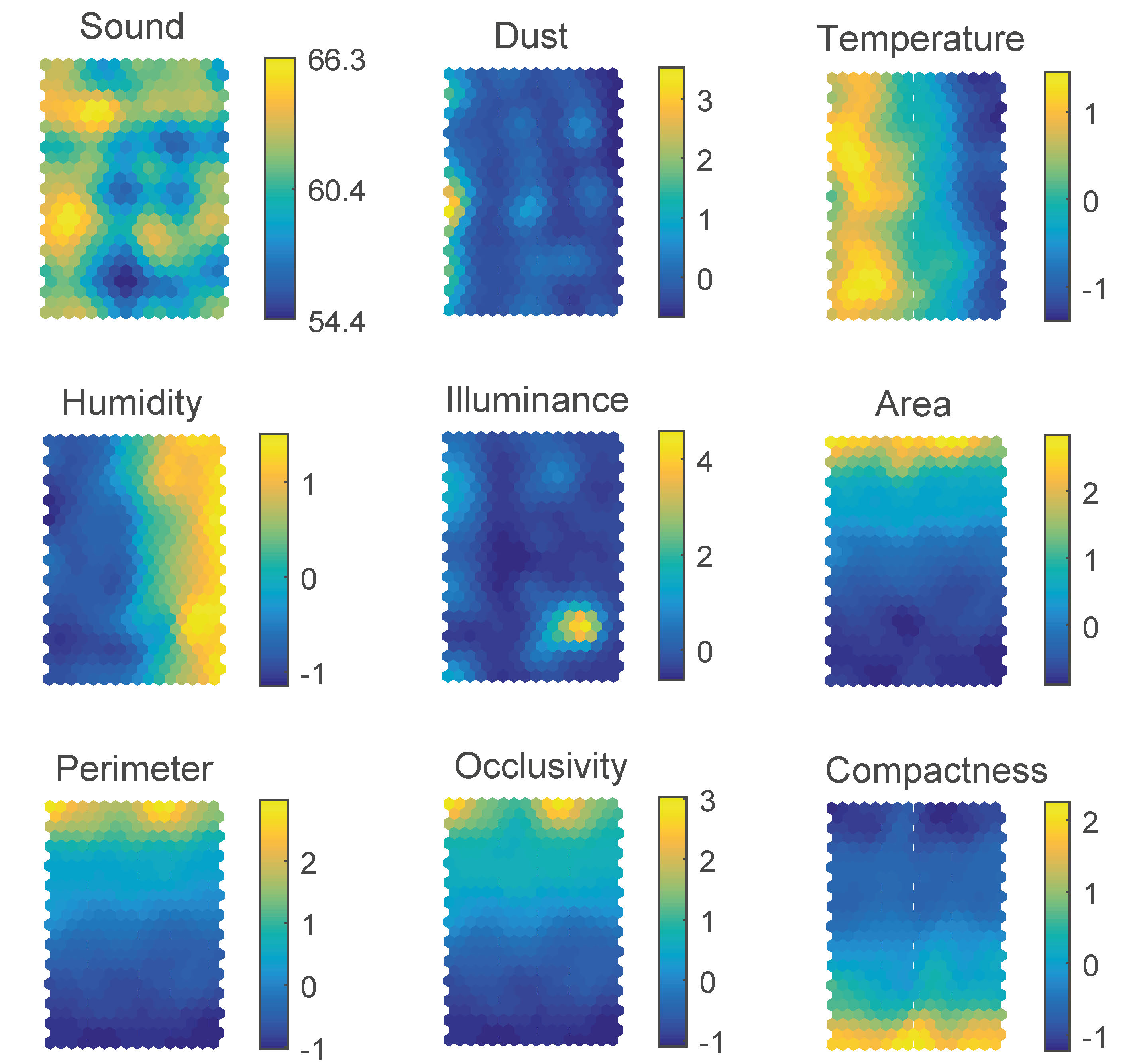 |
Reading the maps: Comparing U-Matrix and F-Matrix one can observe that some clusters on U-Matrix are due to low dust values, some clusters are due to high illuminance, and some cluster are due to low illuminance. That cluster being identified and comparing clusters on U-Matrix with L-Matrix, one concludes that many participants who experience high illuminance responded physiological arousal state and many participant experiences low dust responded physiological normal state. Similarly, the influence of other environmental features may also be analyzed by comparing these maps.
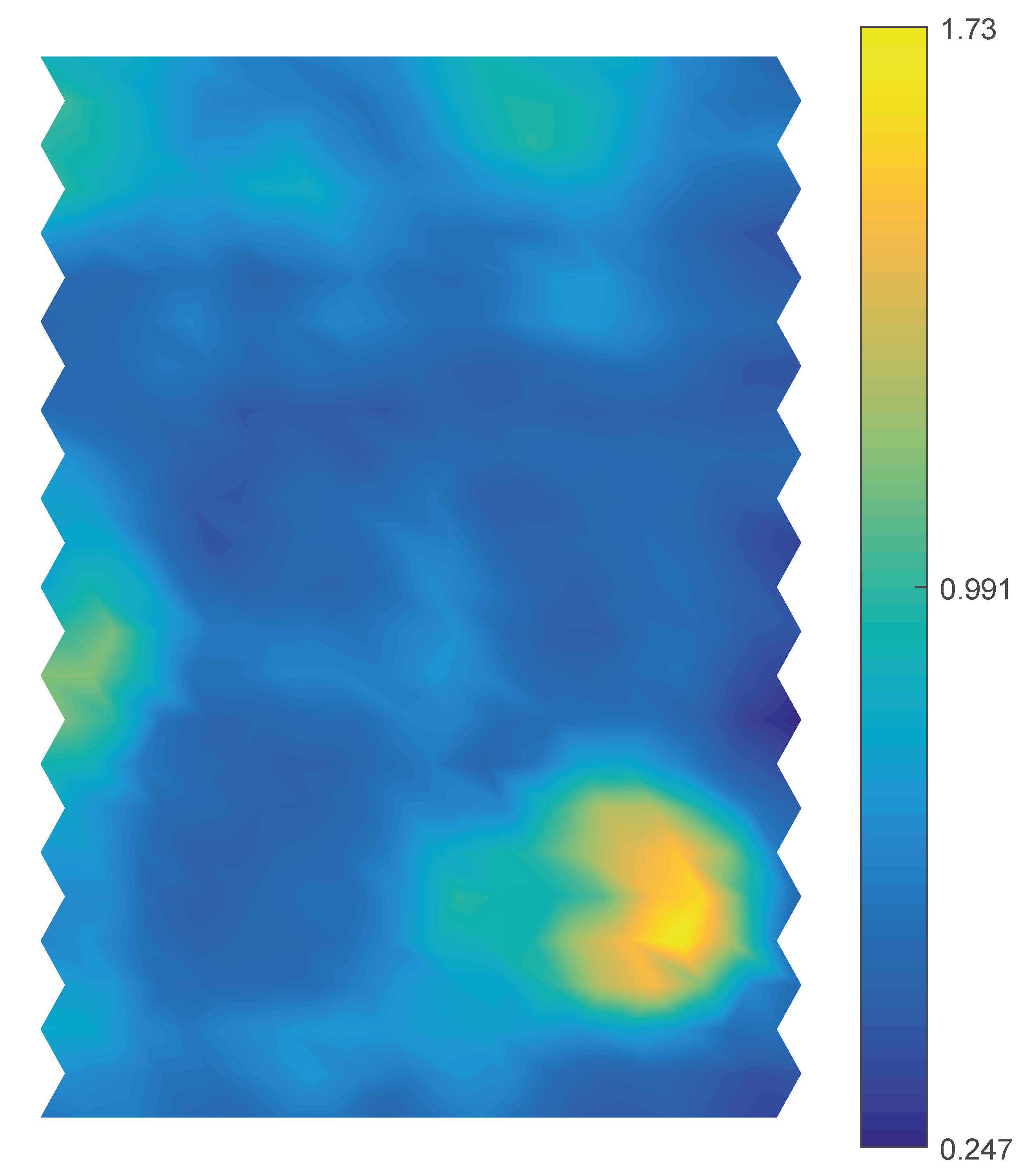
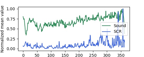
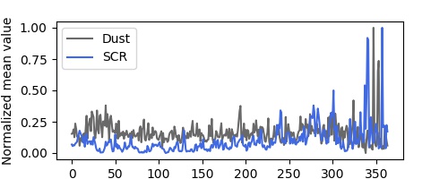
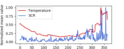
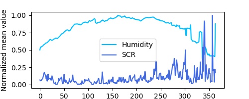
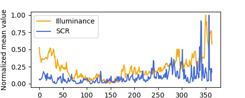
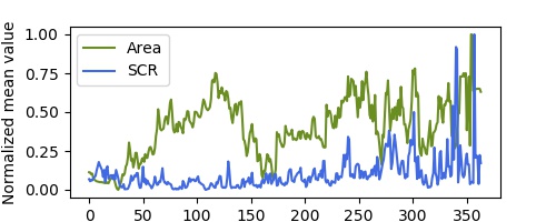
Correlations
How environmental features are related to each other and how they are related to participants physiological response in the independent event-referenced mean of features were computed and Pearson r between the feature were computed.
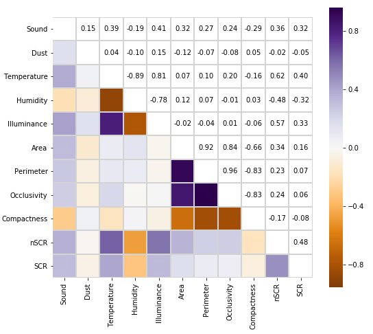
A pairwise plot of computed event-referenced mean of environmental feature and physiological responses (SCR) across all participant is shown here:
 |
 |
 |
 |
 |
 |
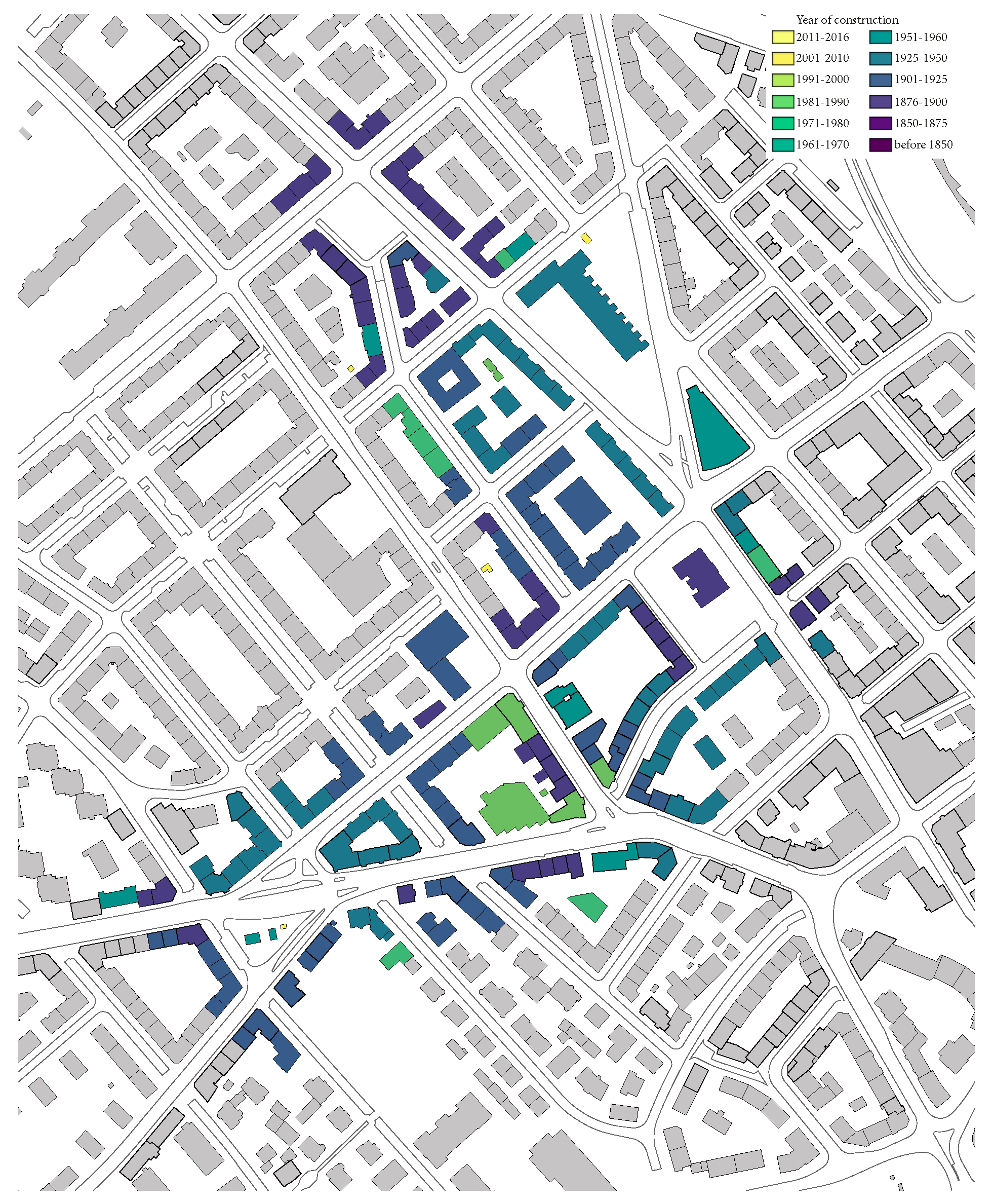
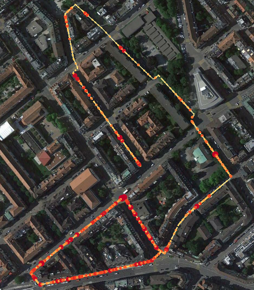
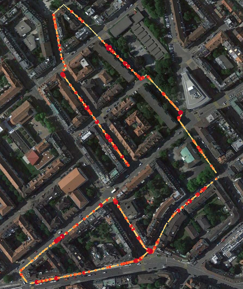
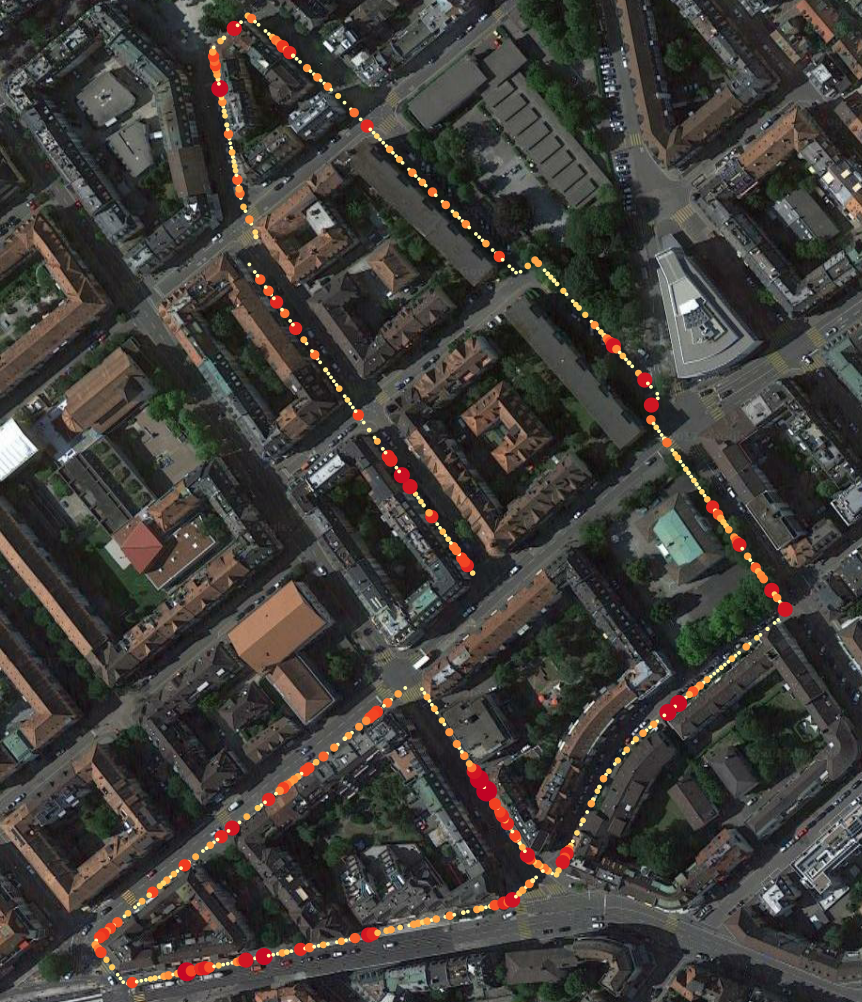
Geo-reference
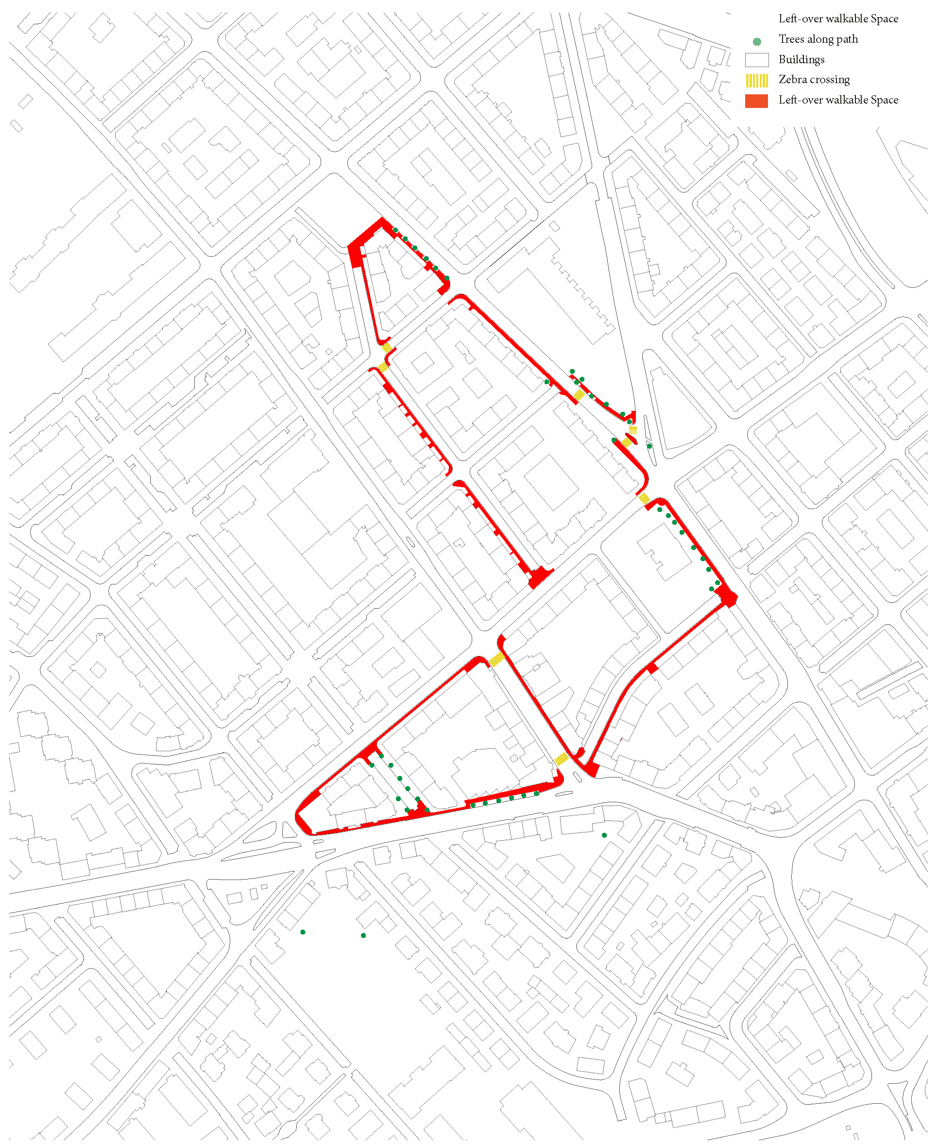
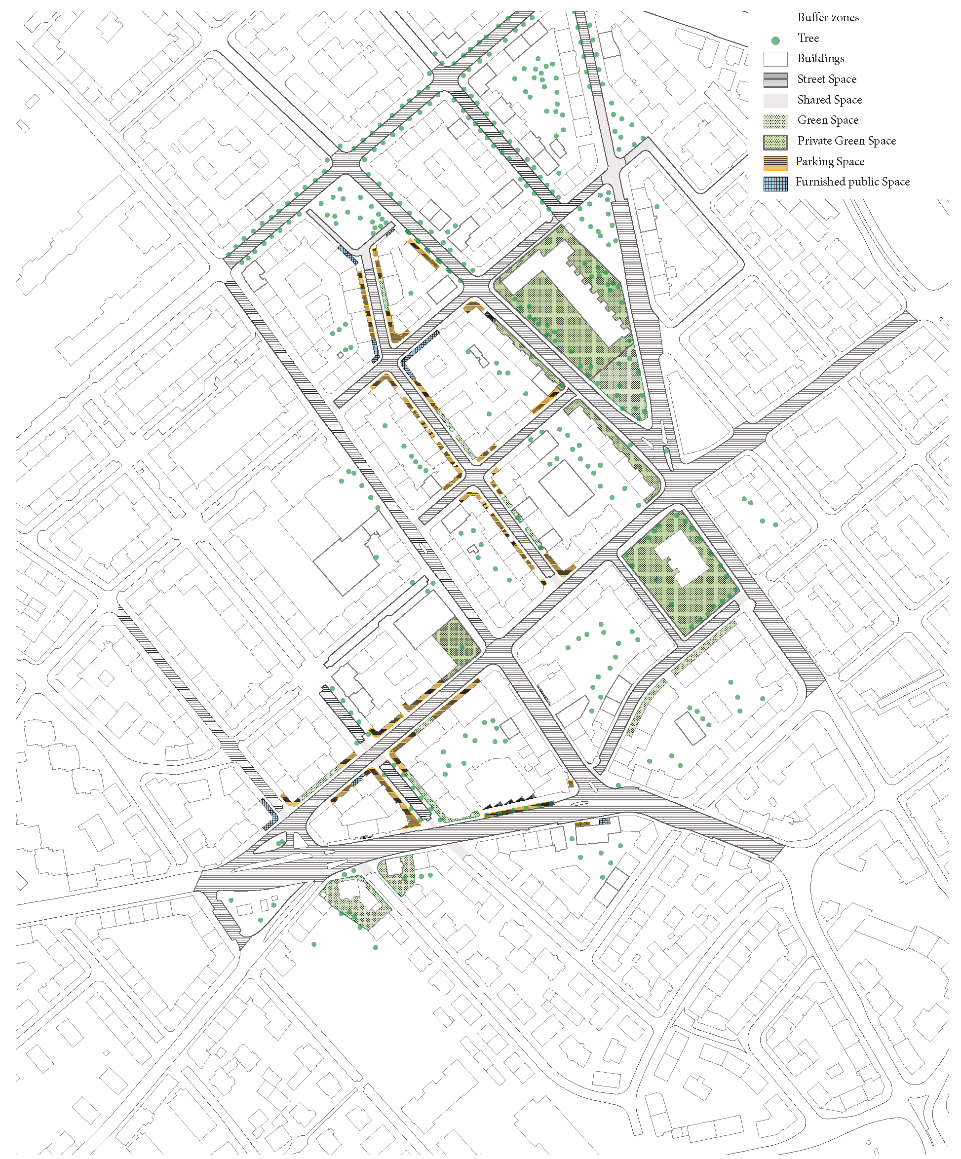
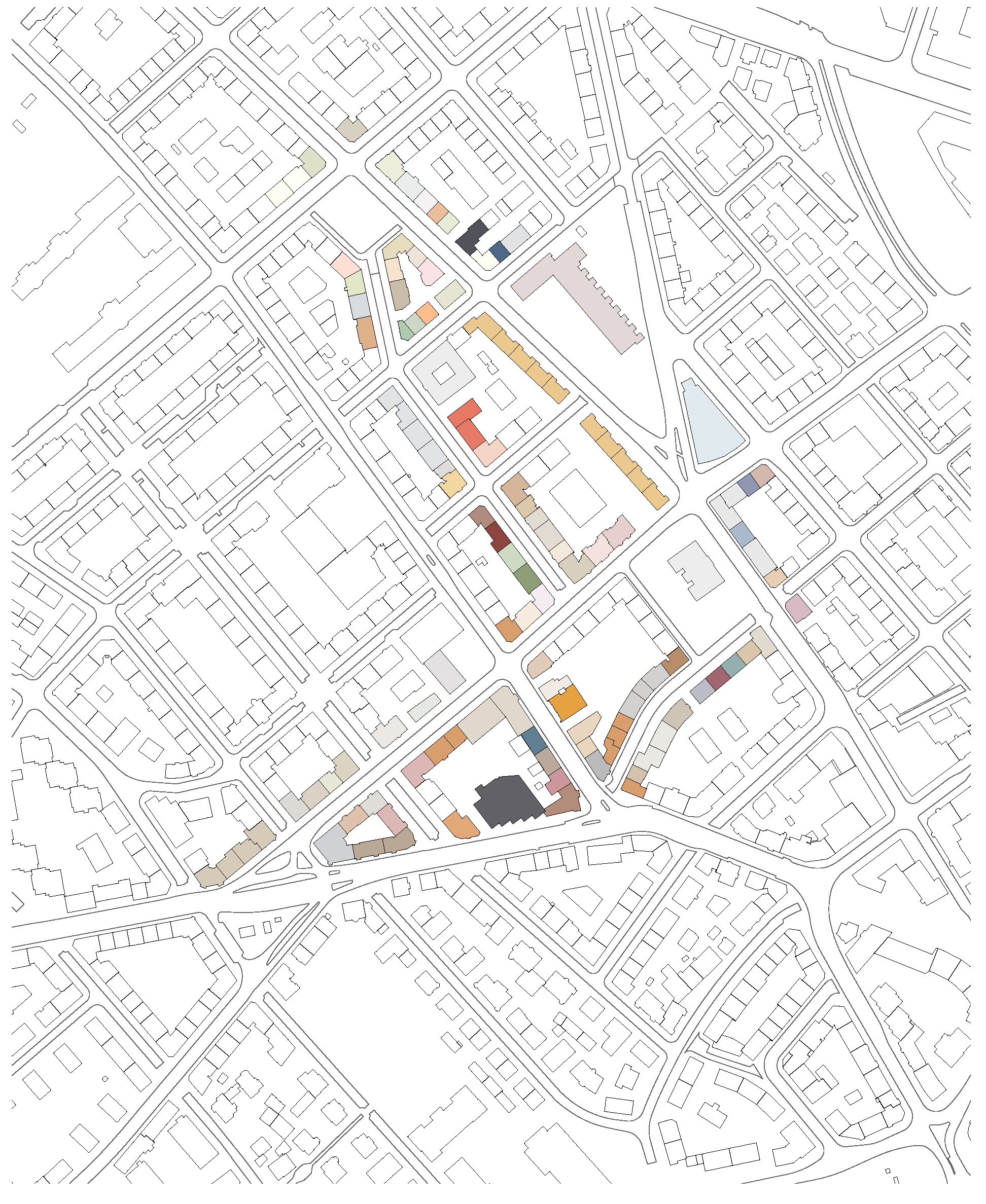
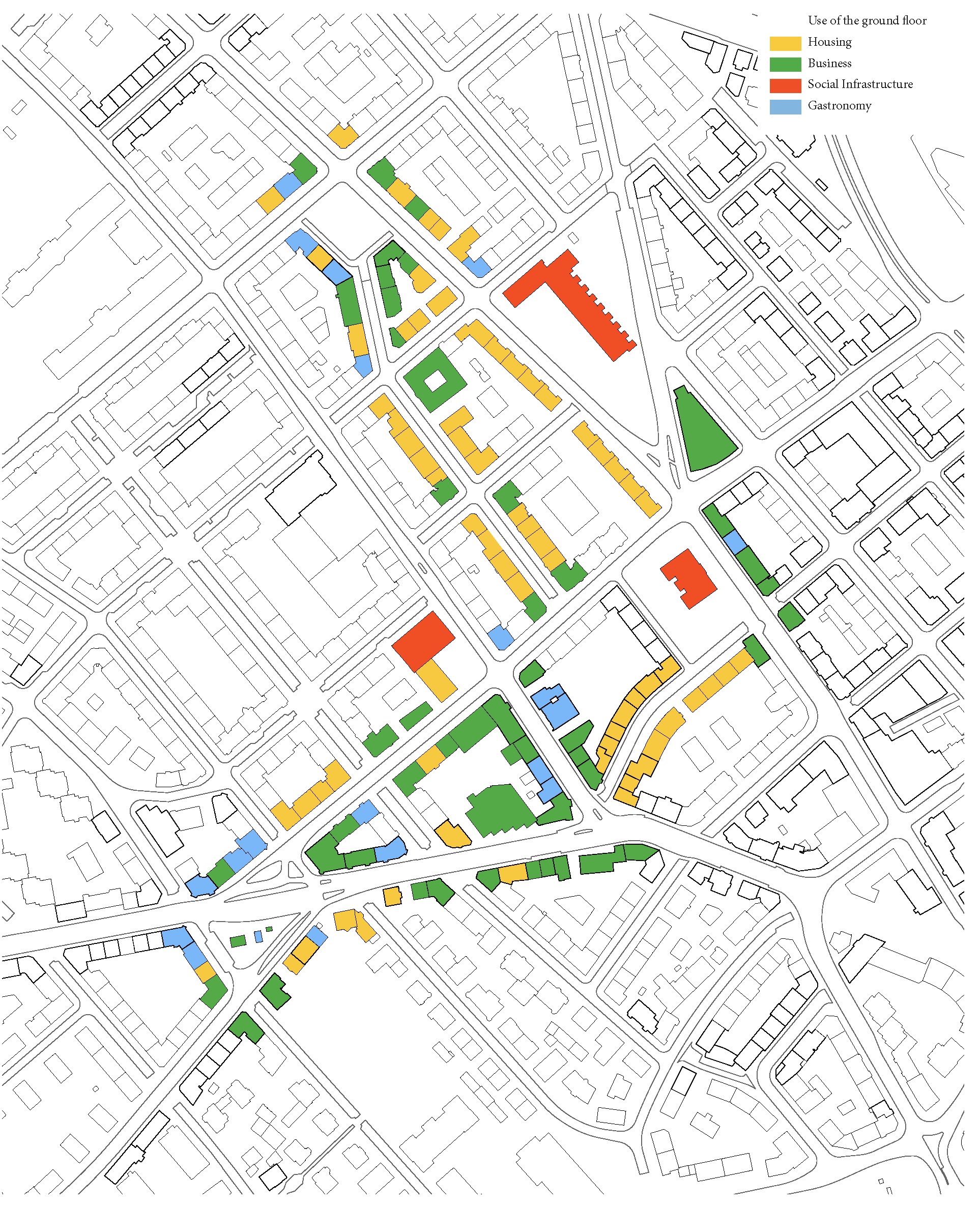
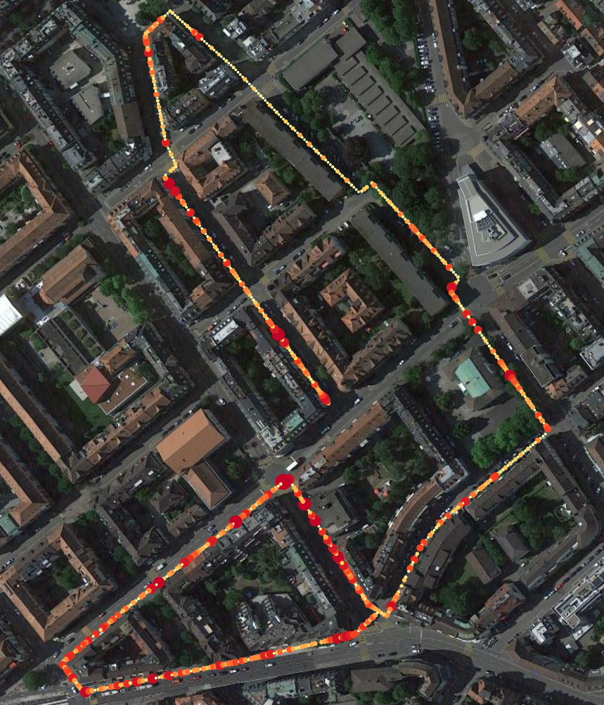
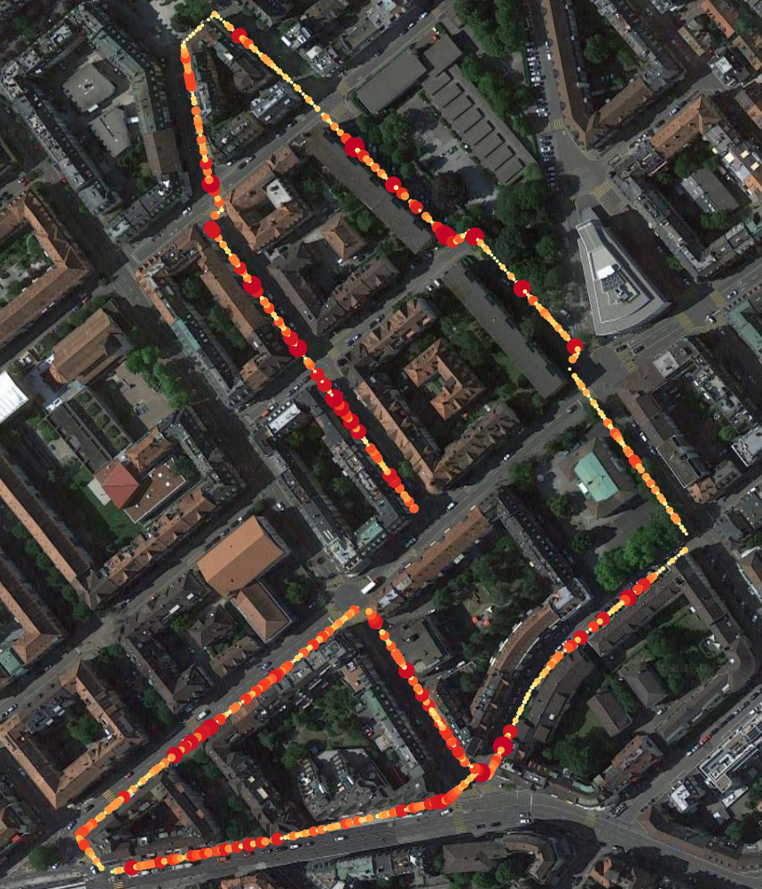
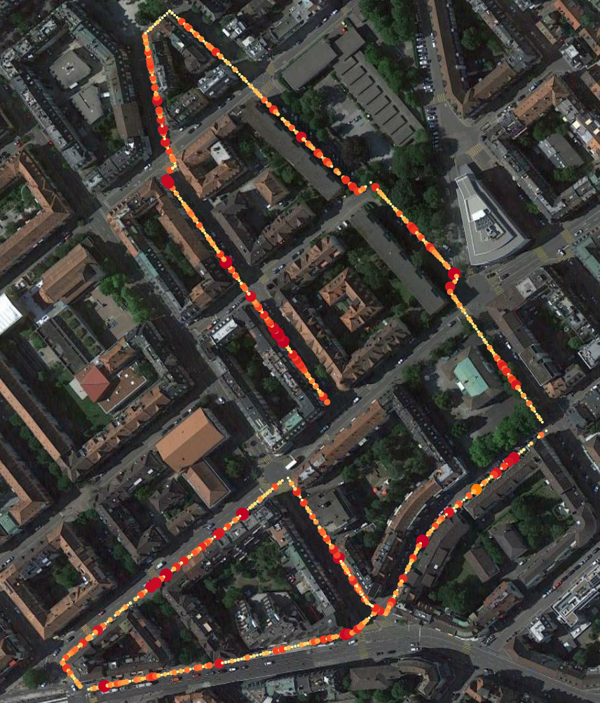
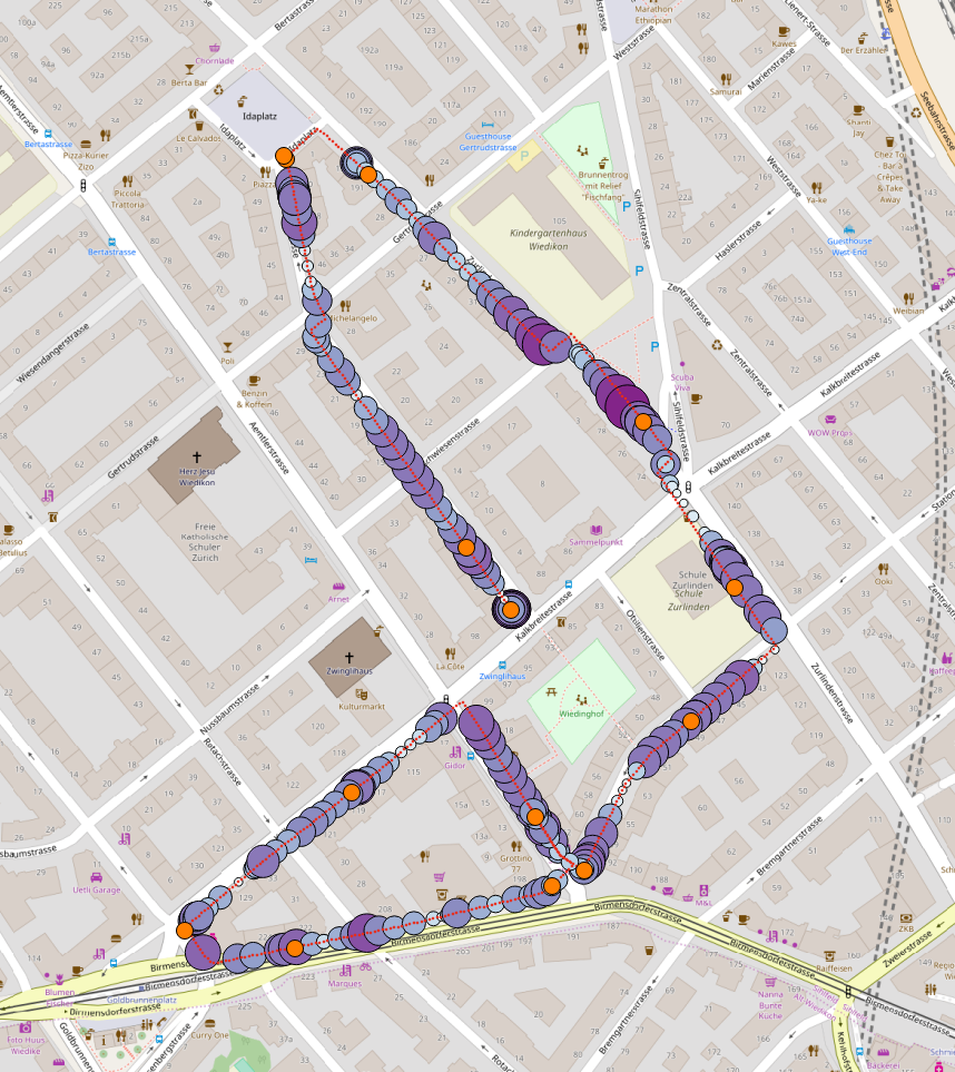
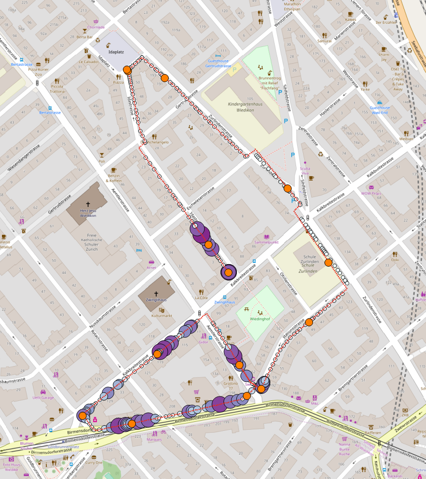
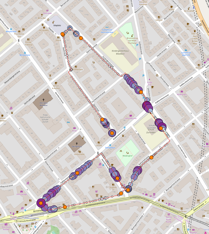
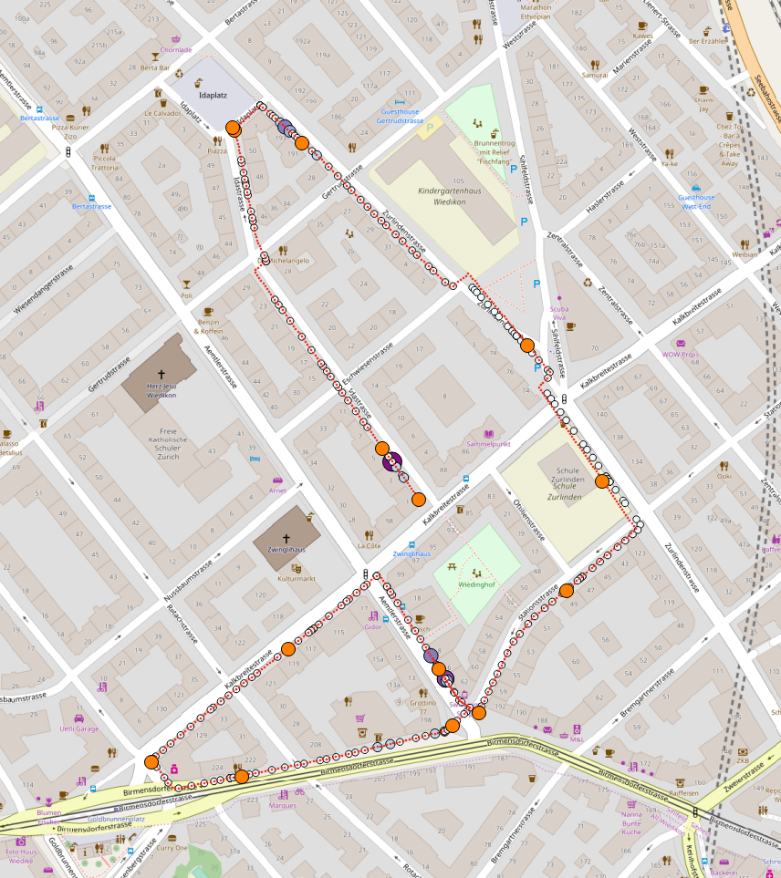
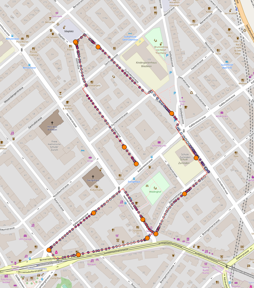
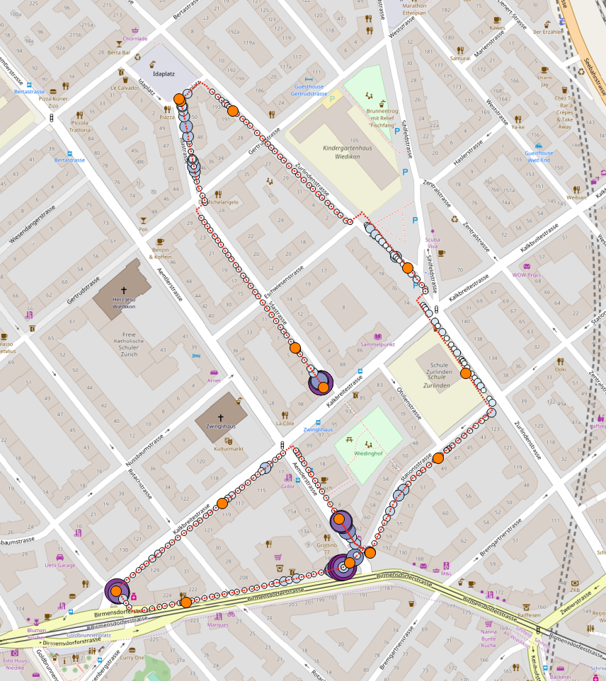
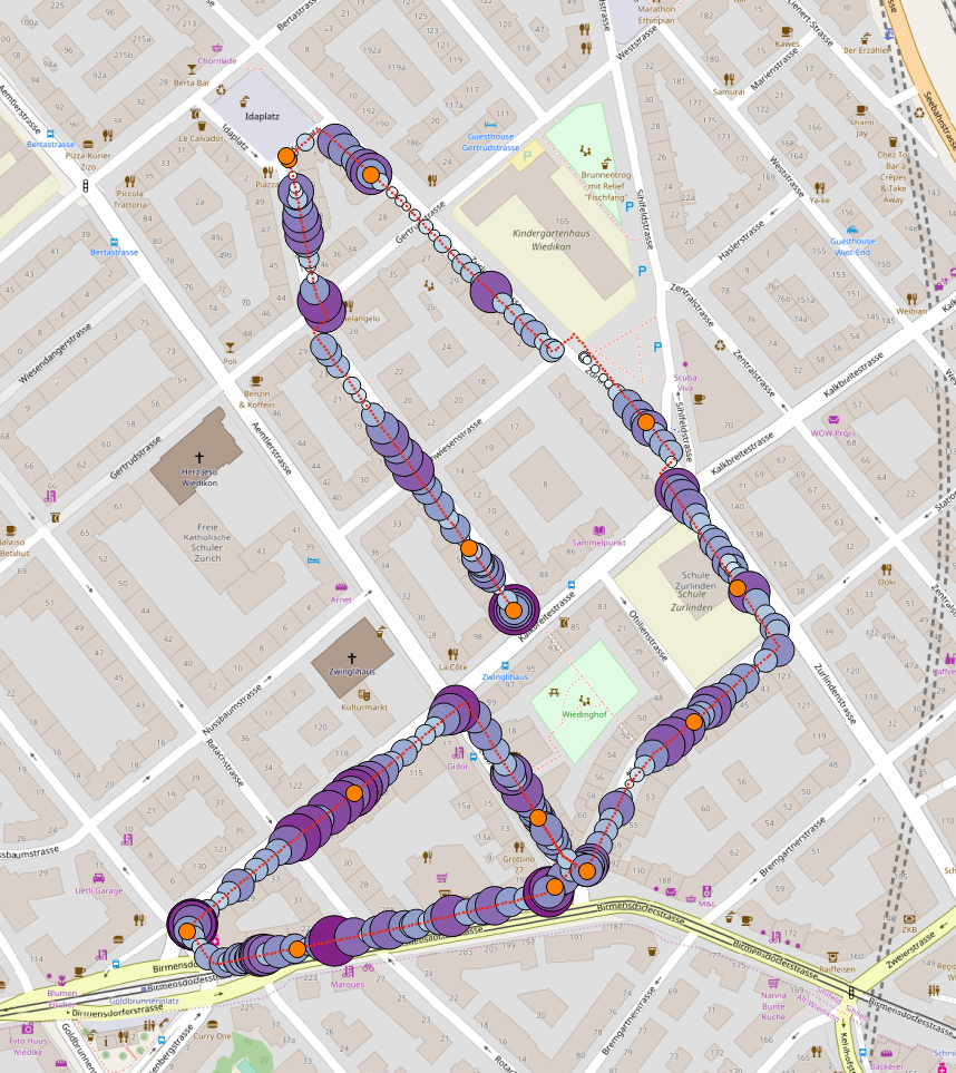
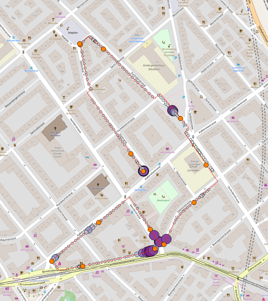
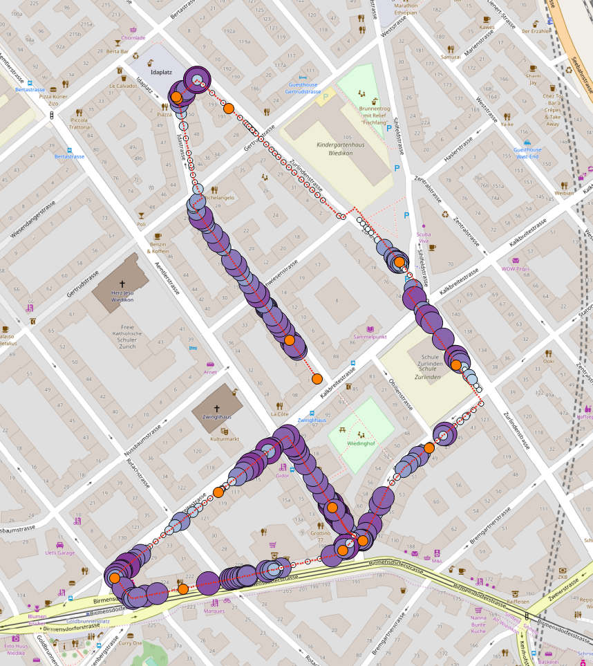
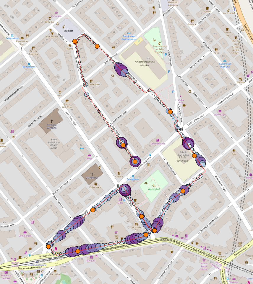
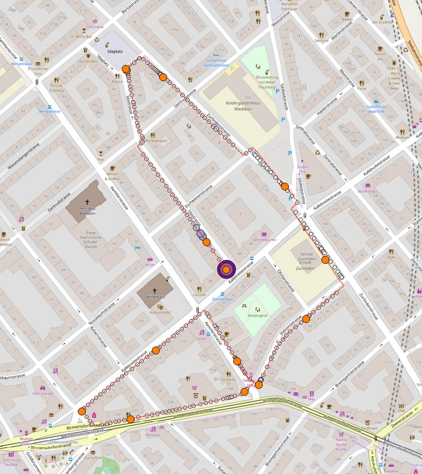
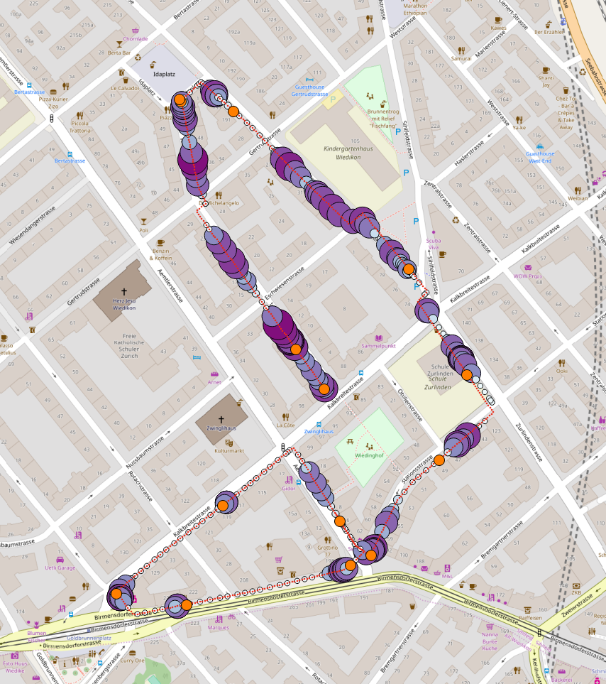
To physically observe how participants responded to the dynamics of the urban environment, the geo-referenced mean of participants physiological responses were computed and plotted on the actual map of the study neighborhood.
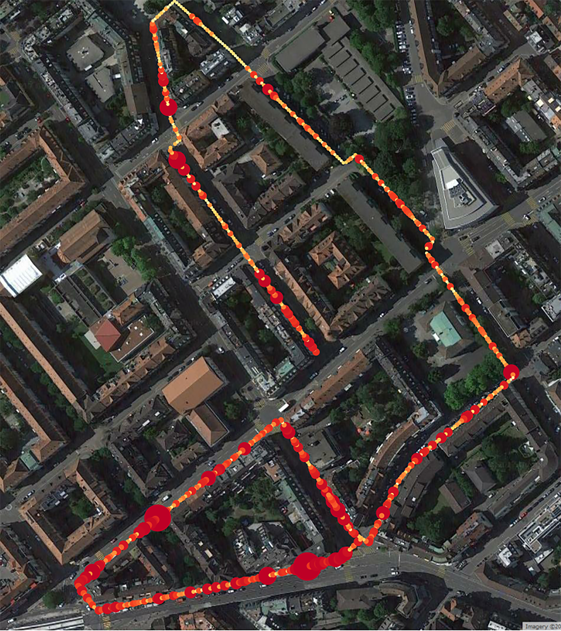
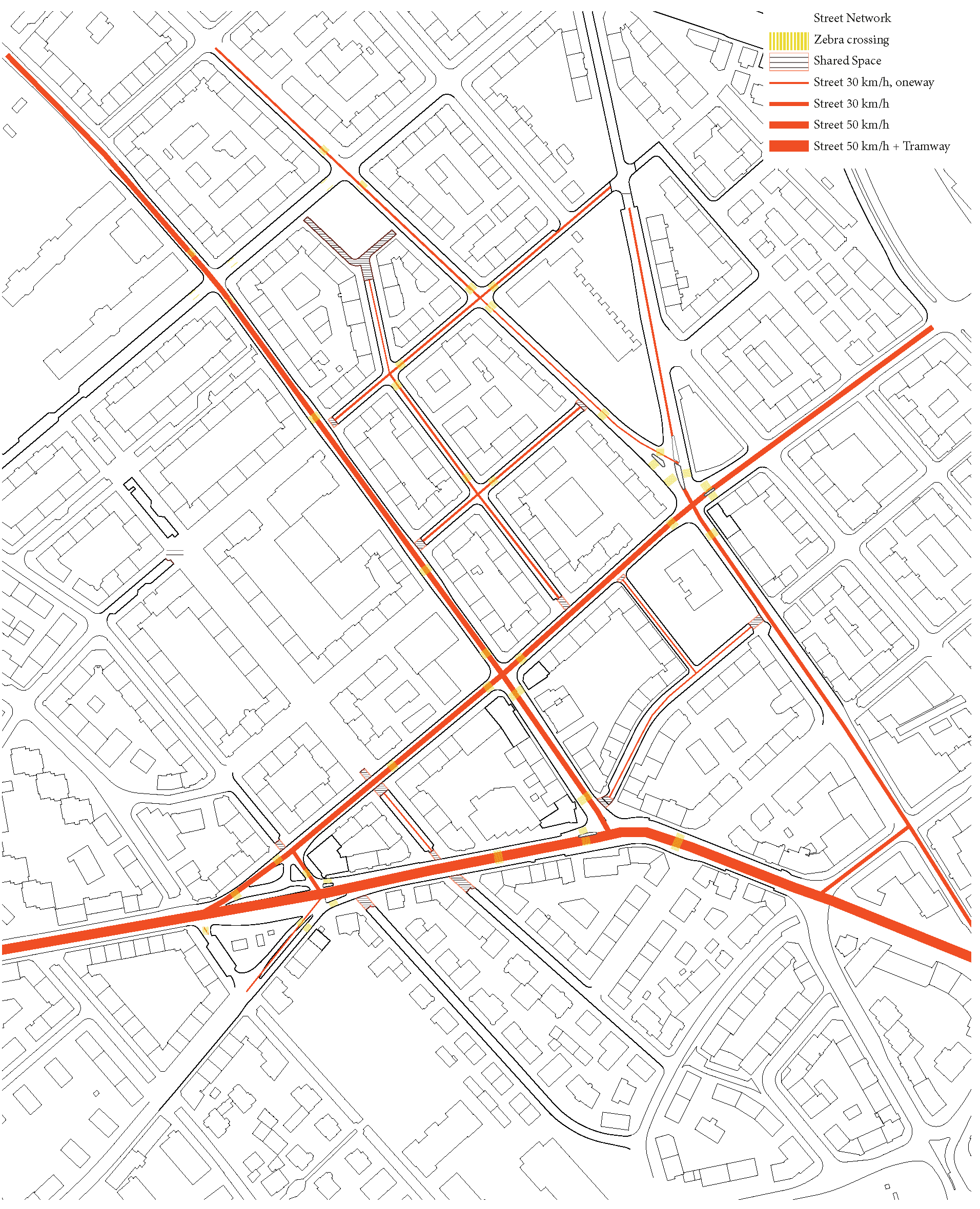
The geo-referenced physiological response may be compared with various urban environment features, such as traffic speed, walkable space, the configuration of walkable space, facades color, the primary use of ground floor of the buildings, and the construction year of the buildings along the study path. Plots of these mentioned urban environmental features are illustrated as follows:
 |
 |
 |
 |
 |
 |
Demography
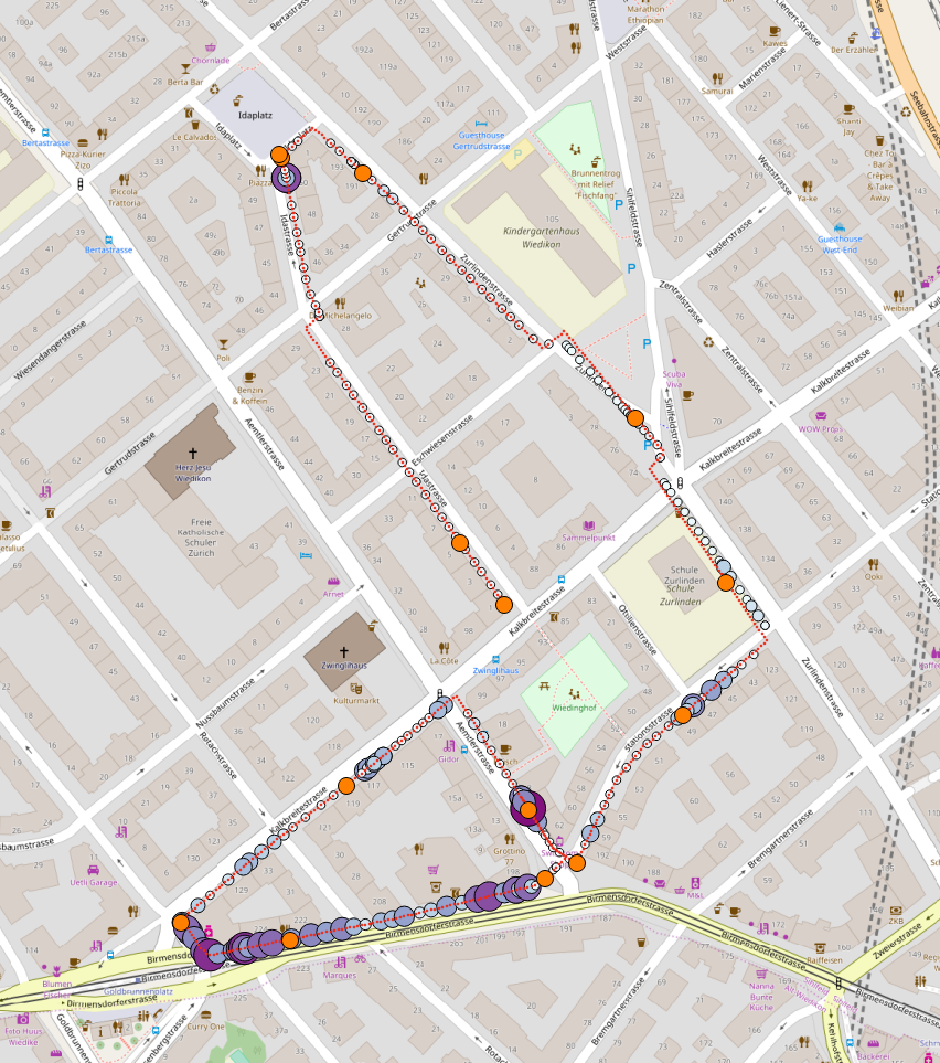
Further geo-referenced mean physiological responses were computed sets of participants belonging to different demographic profiles. From the complete set of participants, seven sets corresponding to the set of participants of age group between 20-29, participants of age group 30 and above 30, set of participant familiar with a similar environment, set of participants unfamiliar to the environment, set of participant having upbringing of village, set of participants having upbringing of city, and set of participants having upbringing of Metros were formed. The computed geo-referenced mean physiological responses are plotted on the actual Map of the City separately for each set are as follows:
| Age group 20+ | Age group 30+ |
|---|---|
 |
 |
| Familiar participants | Unfamiliar participants |
|---|---|
 |
 |
| Villages | City | Metro |
|---|---|---|
 |
 |
 |
To test the significance of the difference between the variance groups of pairwise t-test statistics were conducted. The results of the t-test statistics are as follows:
| Age group 20+ | Age group 30+ | Familiar participants | Unfamiliar participants | ||
|---|---|---|---|---|---|
| Average | 0.12 | 0.18 | 0.13 | 0.15 | |
| statistics | 8.725 | 2.281 | |||
| \(p\)-value | 1.533\(e^{-17}\) | 0.022 |
Pairwise t-test between the geo-referenced mean physiological responses computed for the set of participants belonging to village, city and metros are as follows:
| Village | City | City | Metro | Village | Metro | |||
|---|---|---|---|---|---|---|---|---|
| Average | 0.13 | 0.17 | 0.13 | 0.11 | 0.17 | 0.11 | ||
| statistics | 2.763 | 6.358 | 8.475 | |||||
| \(p\)-value | 0.0059 | 3.002\(e^{10}\) | 8.989\(e^{-17}\) |
Note: Here t-test statistics was conducted with an \(\alpha = 0.05\).
Individuals
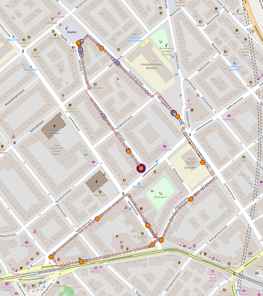
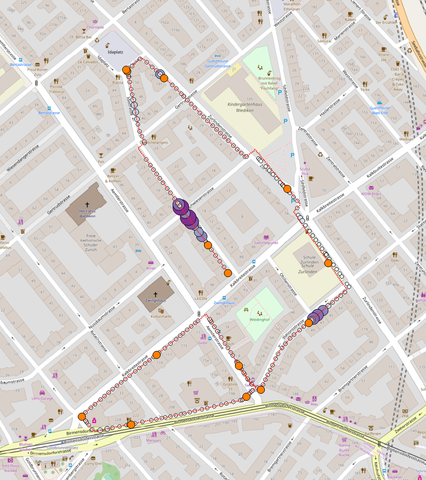
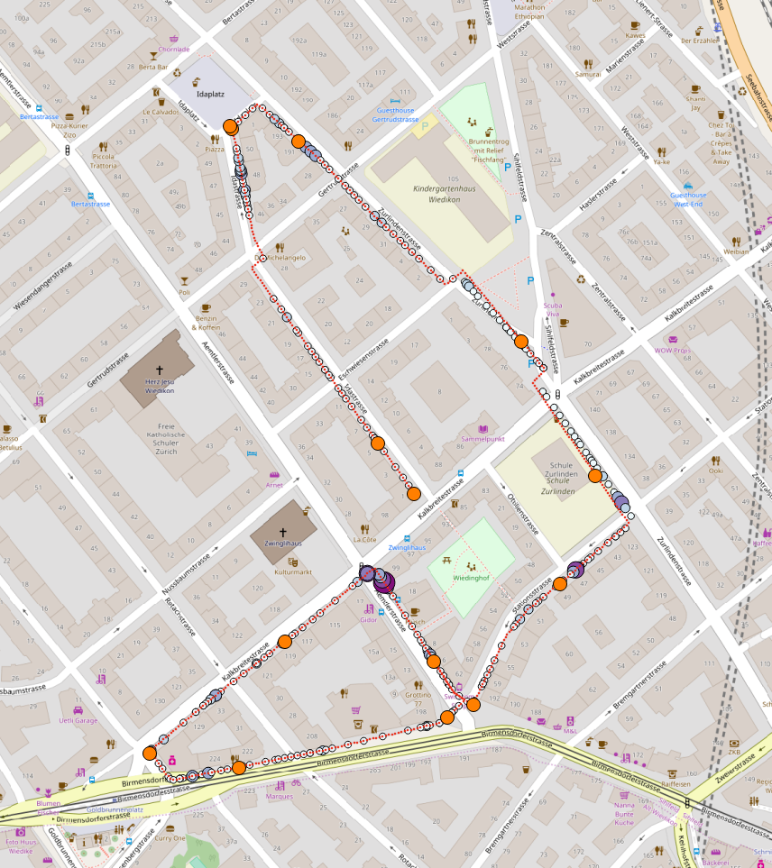
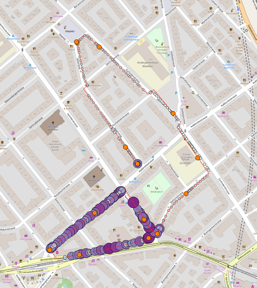
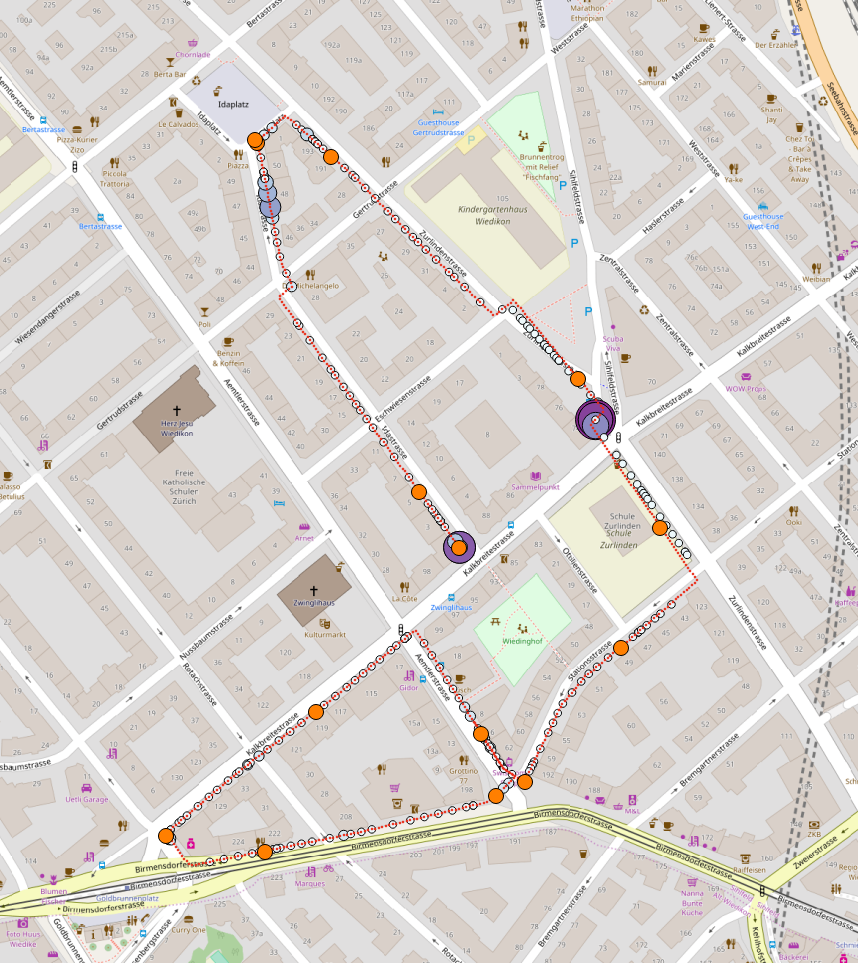
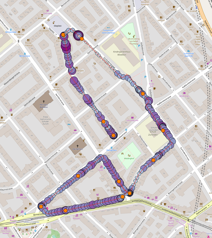
Unlike geo-referenced mean of physiological response across all participant, here geo-referenced physiological response of individual participants was displayed. Each participant's geo-referenced physiological response was plotted on the actual Map of City to investigate how an individual responded to an urban environment.
In the plots, D[A\(x\), F\(x\), U\(x\)] indicate the participants demographic information, where A\(x\) = A2 indicates participant belonging to age group 20-29 and A\(x\) = A3 indicates participant belonging to age group 30 and above 30. Similarly, the symbol F\(x\) = Fy indicates that the participant is familiar with a similar as of the study and F\(x\) = Fn indicates that the participant is unfamiliar with a similar as of the study, and U\(x\) = Uv, U\(x\) = Uc, and U\(x\) = Um indicate the participant belonging to an upbringing of village, city, and metro, respectively.
 |
 |
 |
 |
 |
 |
 |
 |
 |
 |
 |
 |
 |
 |
 |
 |
 |
 |
 |
 |
Videos
In this study participants walked in the urban neighborhood. Hence, compared to a static geo-referenced physiological response plot on actual Map of City, a video graphics of geo-referenced physiological response gave a high-resolution information regarding the relationship between urban environment and participants physiological response.
Average arousal computed across all participants displayed on the Map of City in the following video graphics:
Unlike computing average across all participants, individual participants arousal are display on the Map of City using video graphics are as follows:
Conclusions
-
High accuracy of the predictive model indicated that participants physiological responses were highly sensitive to the environmental conditions.
-
Inference results, when compared to environment features, informed that the occurrence of participants' normal physiological conditions tallies with the high frequency of environment features certain range. This indicates that participant arousal condition occurred due to fluctuation/deviation in environmental conditions.
-
Feature selection indicated that certain environmental features were dominant in their influence on participant physiological response. Such dominant environment features were temperature, humidity, Isovist area, and illuminance
-
Pattern analysis using self-organizing map indicated that primarily the participants who experience similar environmental conditions responded in similar physiological condition.
-
Correlation matrix revealed that environmental temperature, illuminance, and Isovist area had the higher impact of participants physiological response than the other features.
-
Geo-referencing of average physiological response across all participants allowed us to investigate as to how participant responses during the actual walk and what additional urban feature would have influence participant physiology. From the videos, it was found that there few spots in the neighborhood where many participants tend to respond in the physiologically aroused state.
-
The demography analysis has revealed that younger participant, the participants familiar with the similar environment, and the participants from metro cities tend to have a more normal physiological response than the participants between age group 30+, the participants unfamiliar with the environment, and the participants from village and cities.